Caps
E-commerce Site
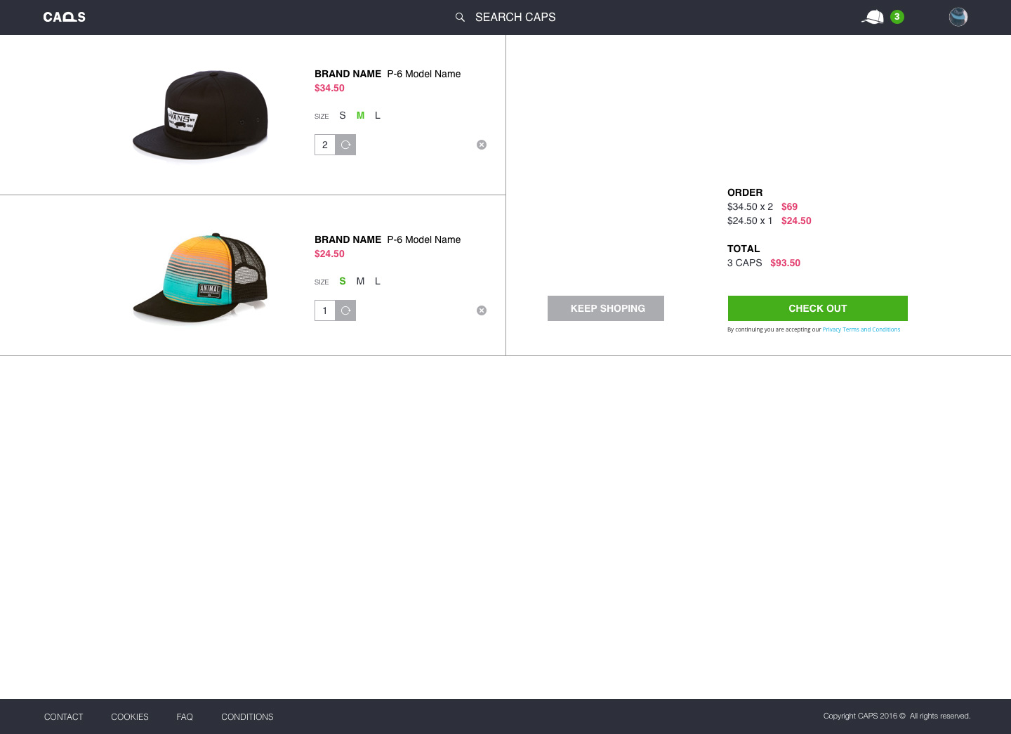
Desktop App

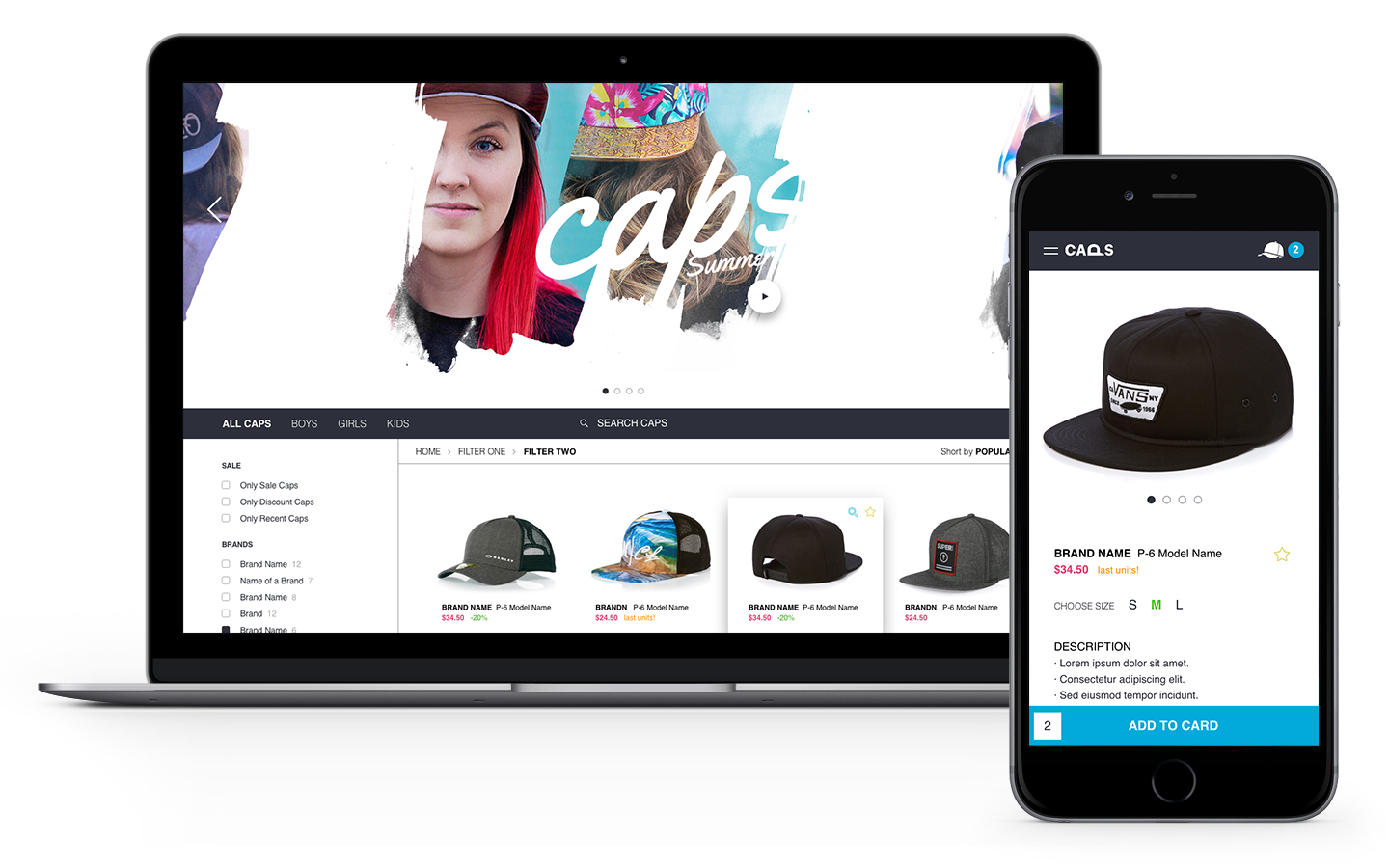
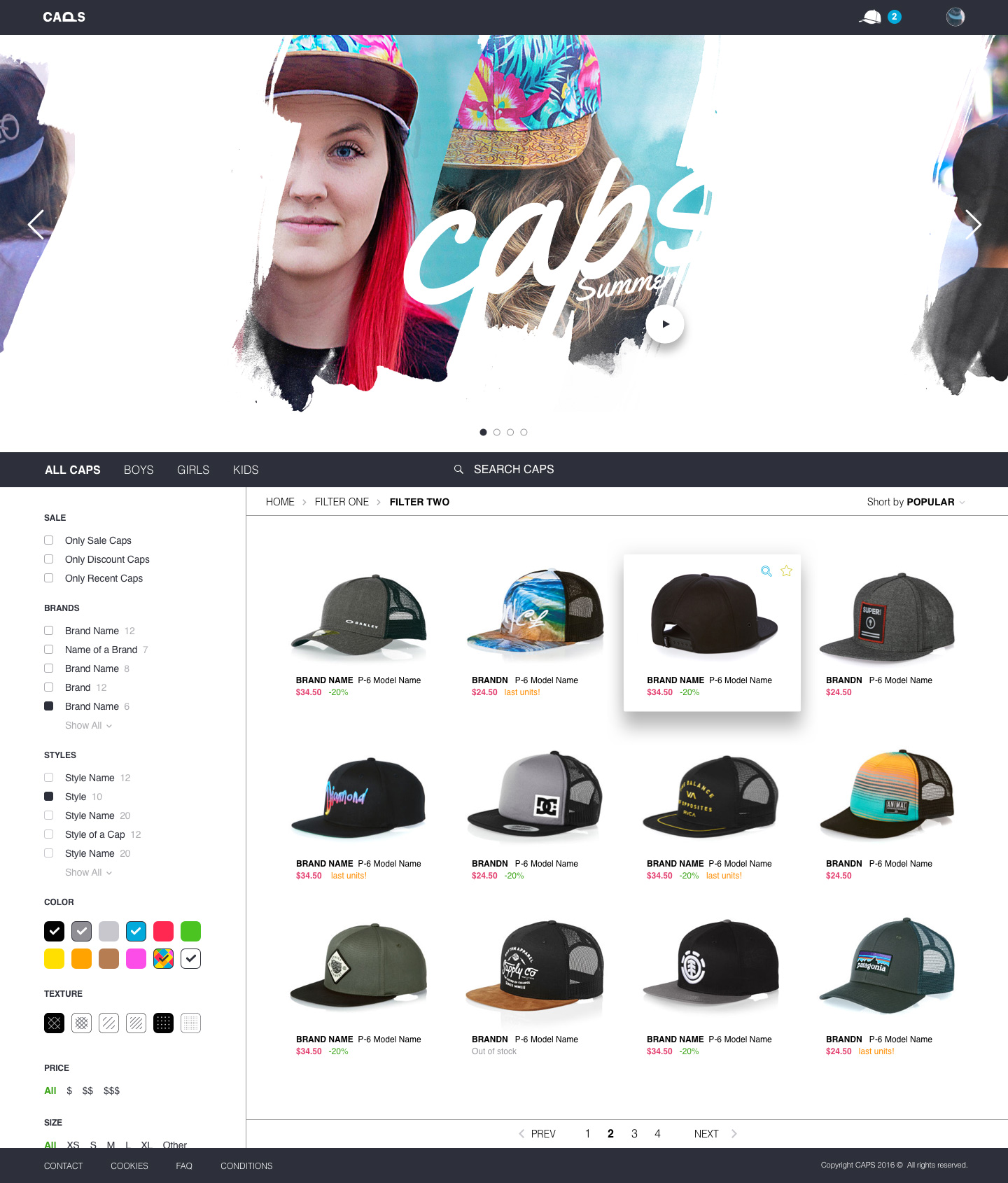
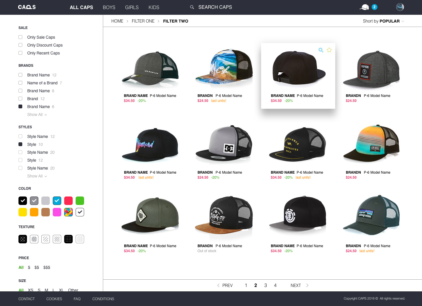
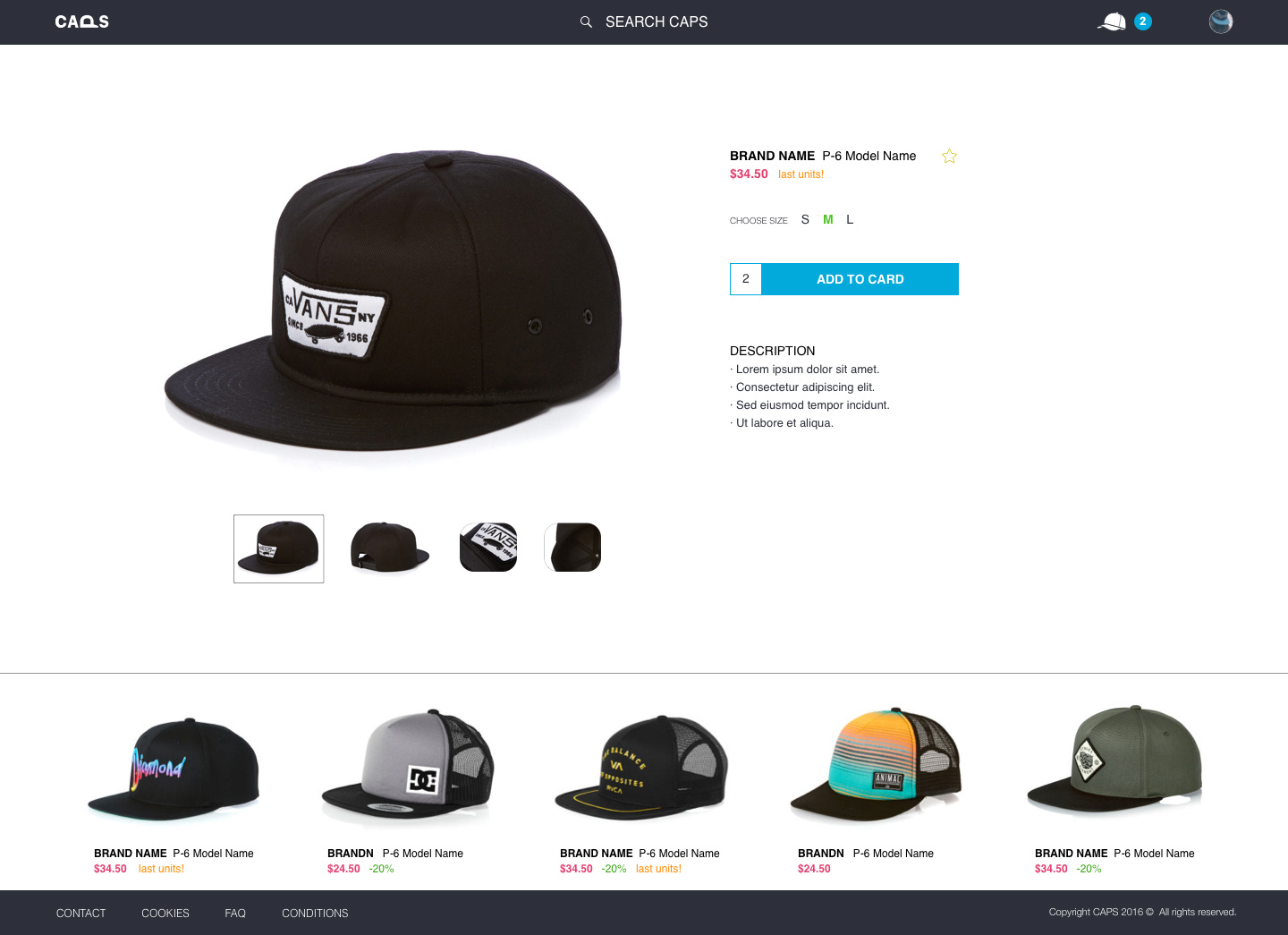
The second bar below the promotional carrousel merges with the navbar of the site when user scrolls. Simple filters bar with independent scroll and whitespace content highlighting the selected product in a simple way.

Mobile App

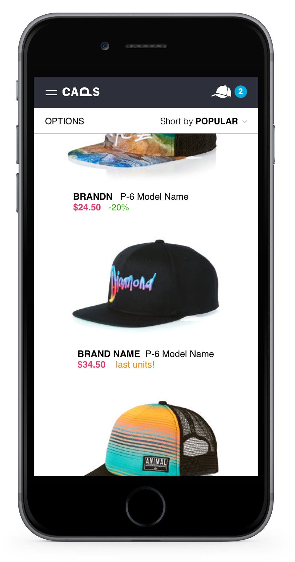
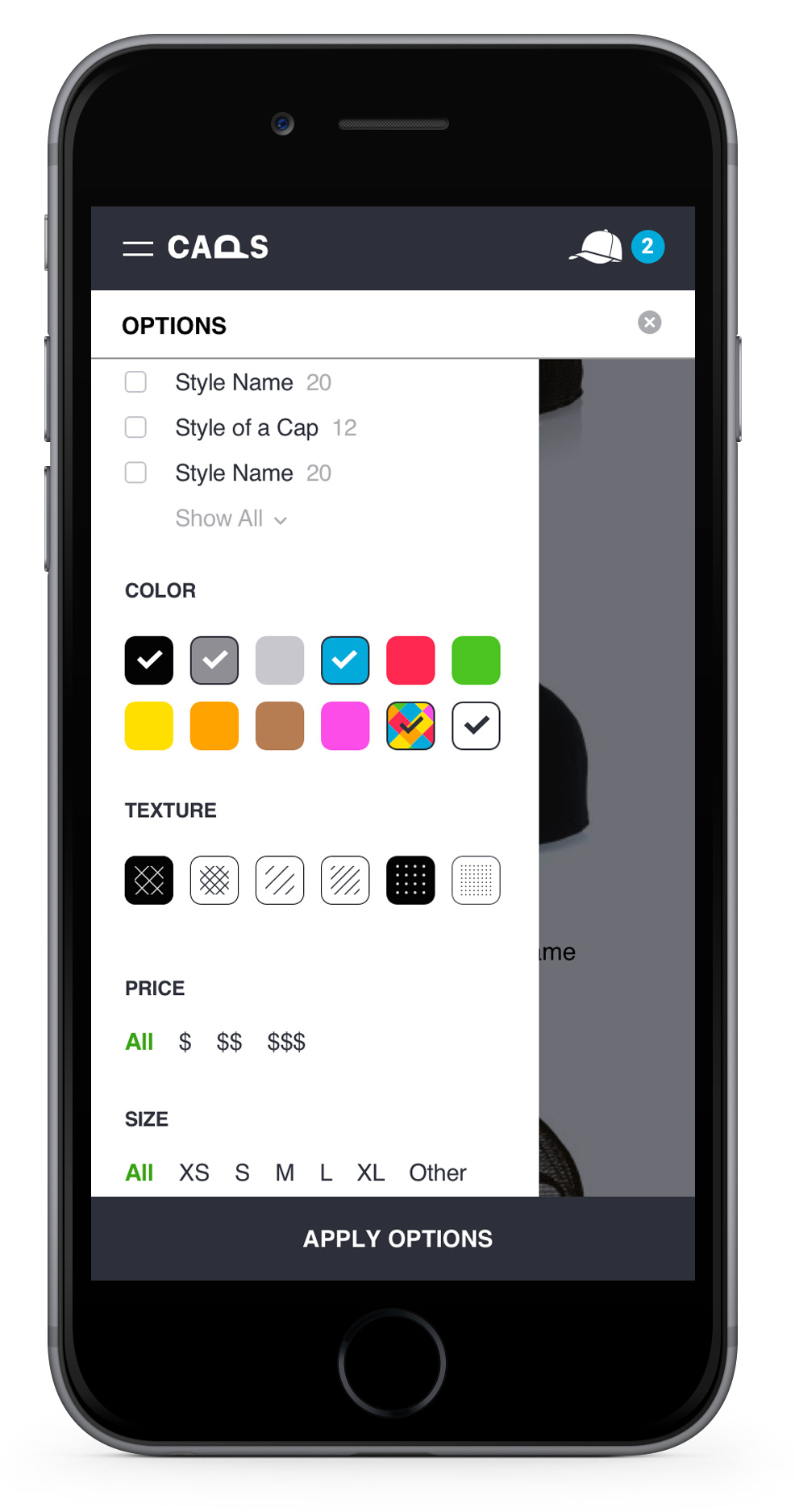
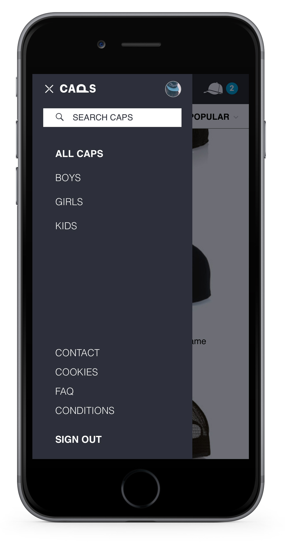
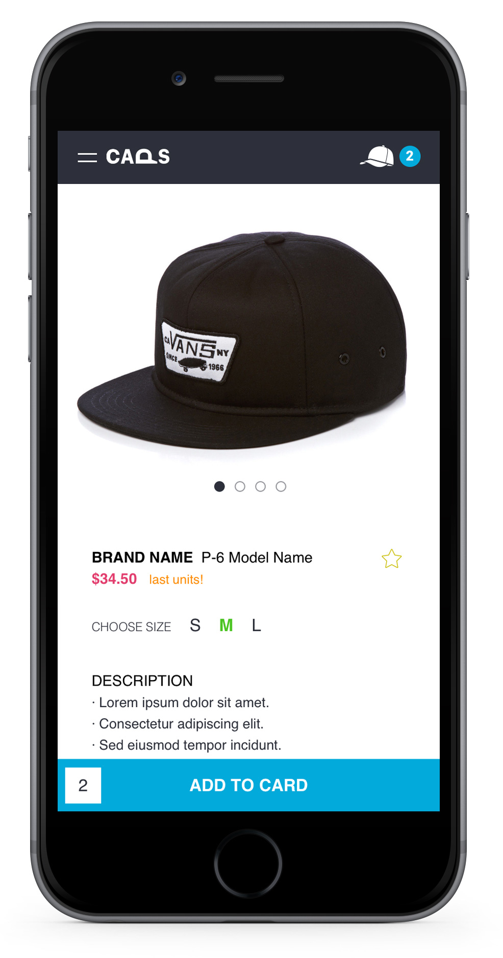
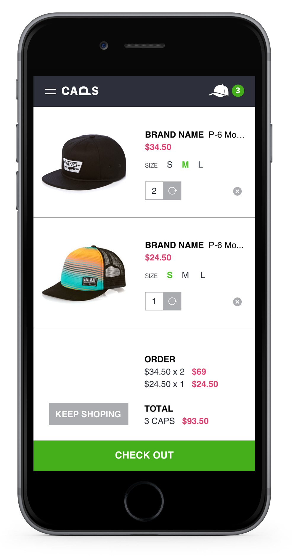
The users only can see the products in the content and the filters & menu shows in a sidebar when user wants. Less space means focusing on showing the main thing. And in this case it is to sell caps so you do not need to show more.

Conclusion

Designing Caps I had to dispense with details and kept a clean design throughout the structure of the app in a consistent manner and strengthen the user experience