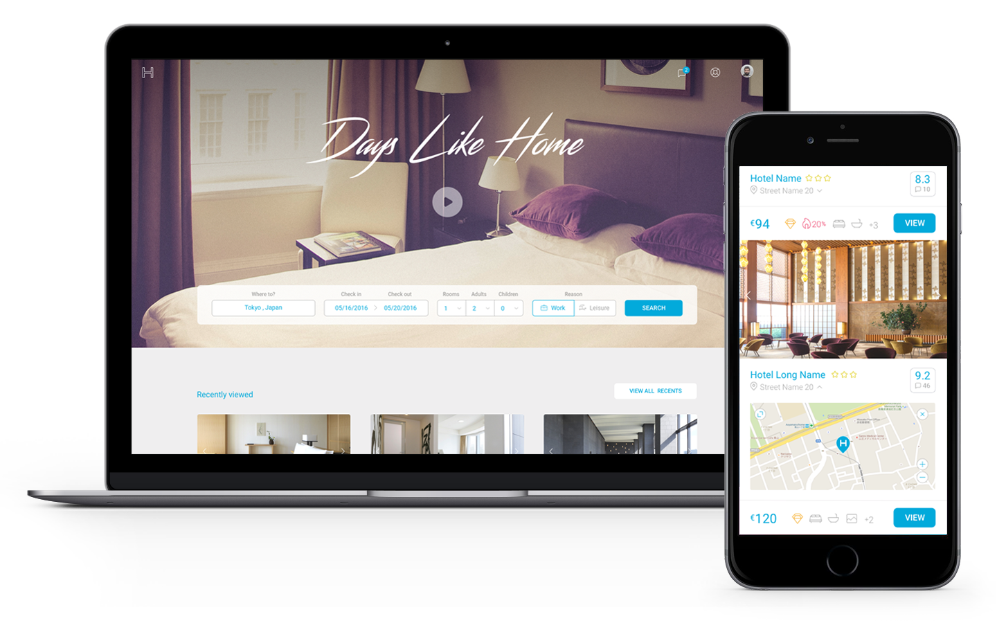
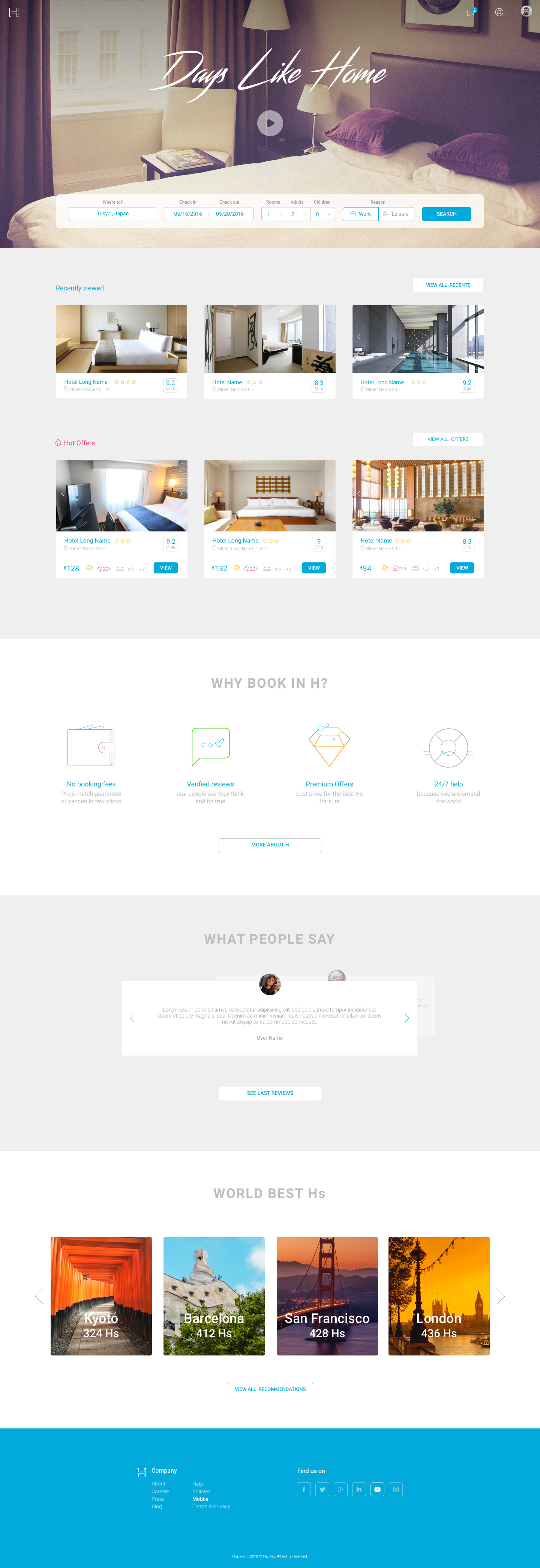
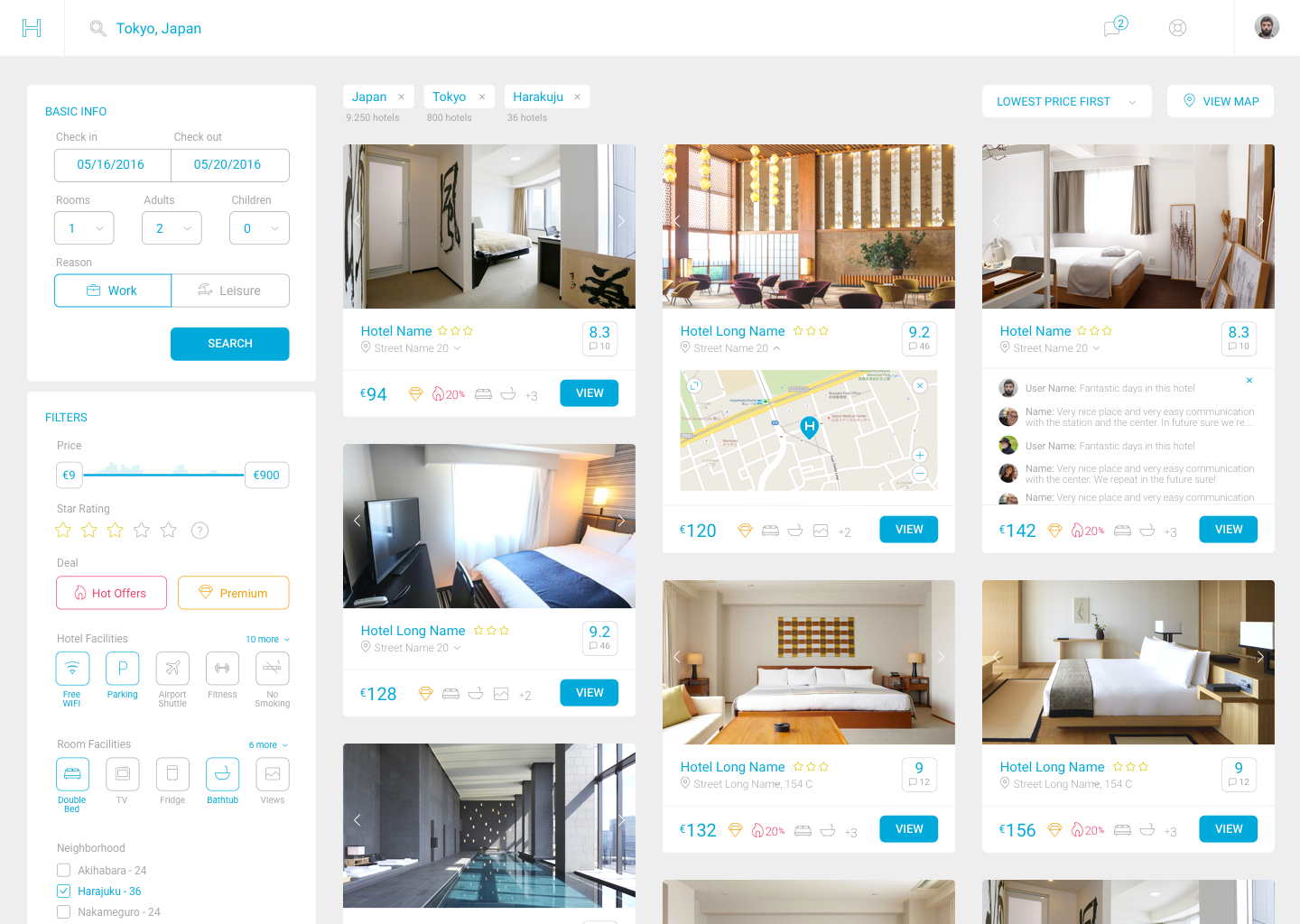
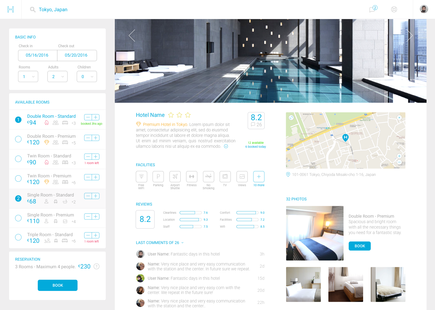
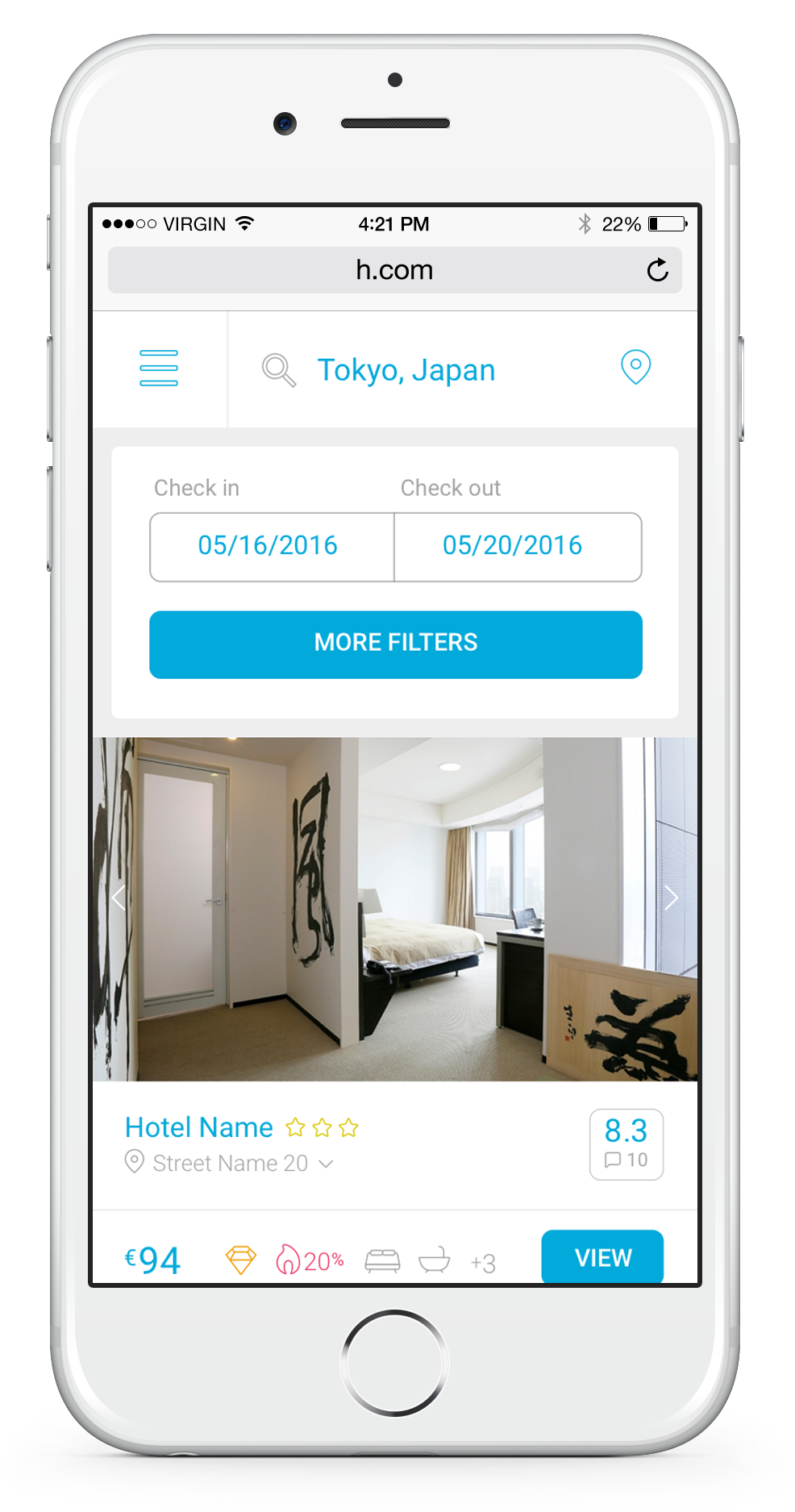
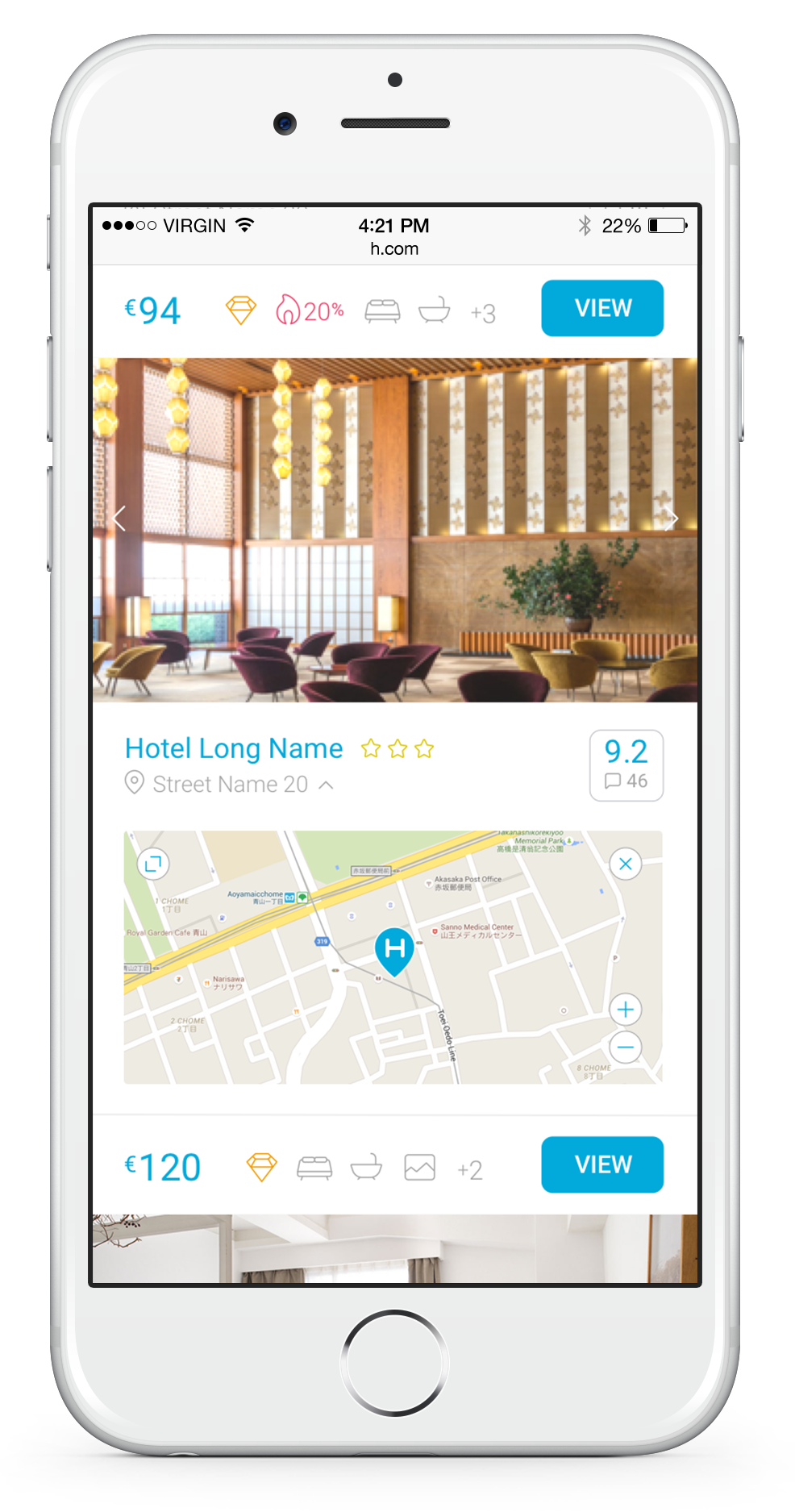
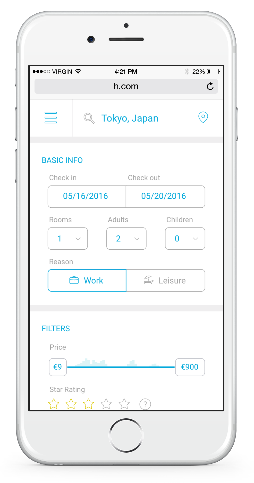
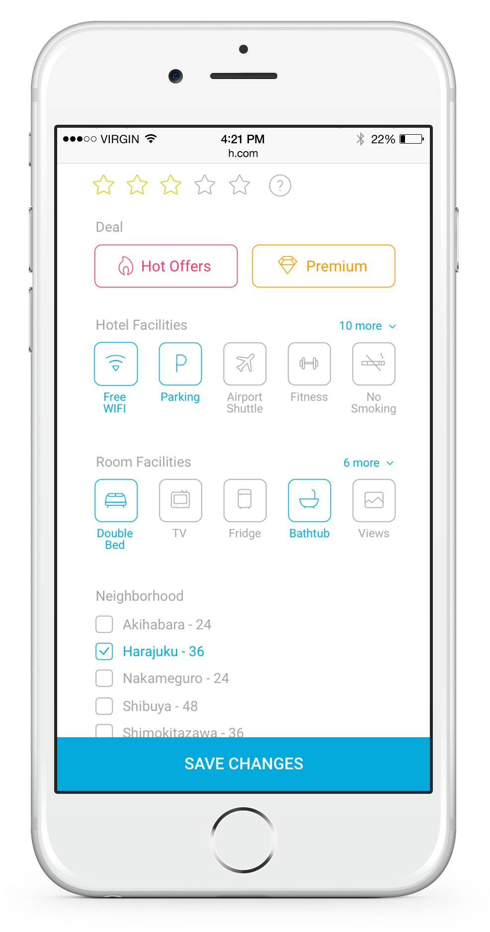
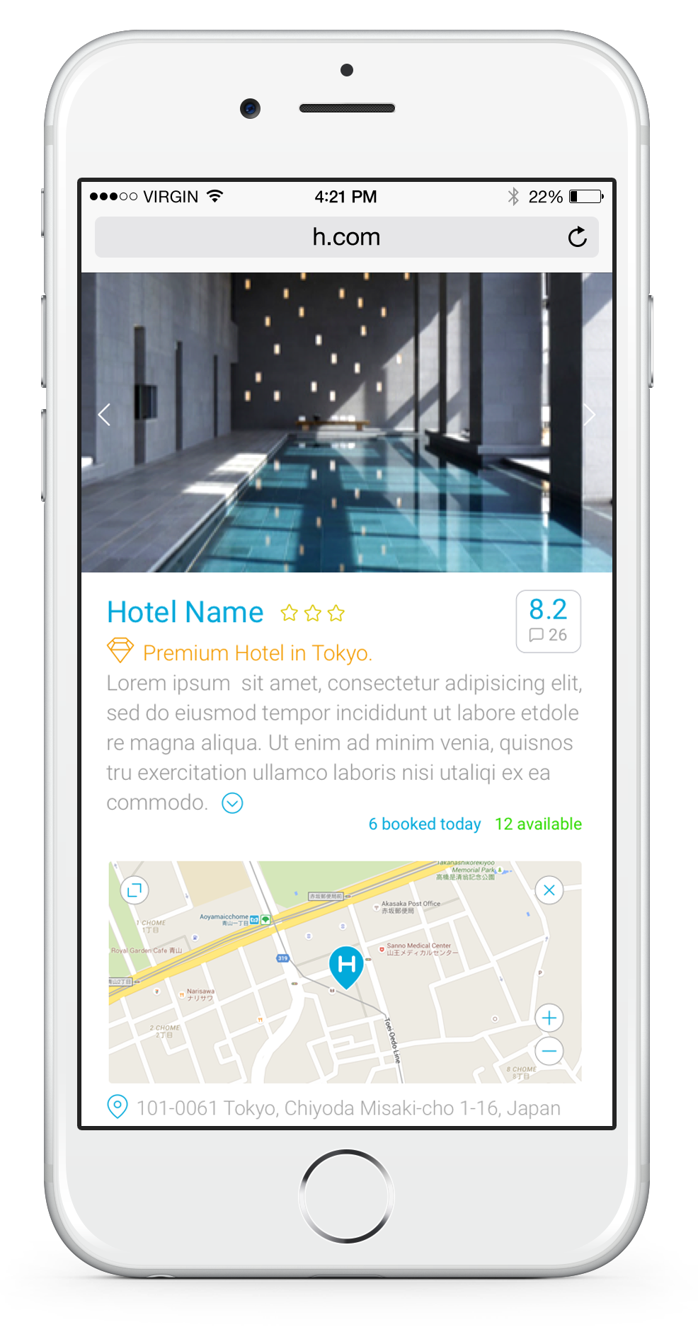
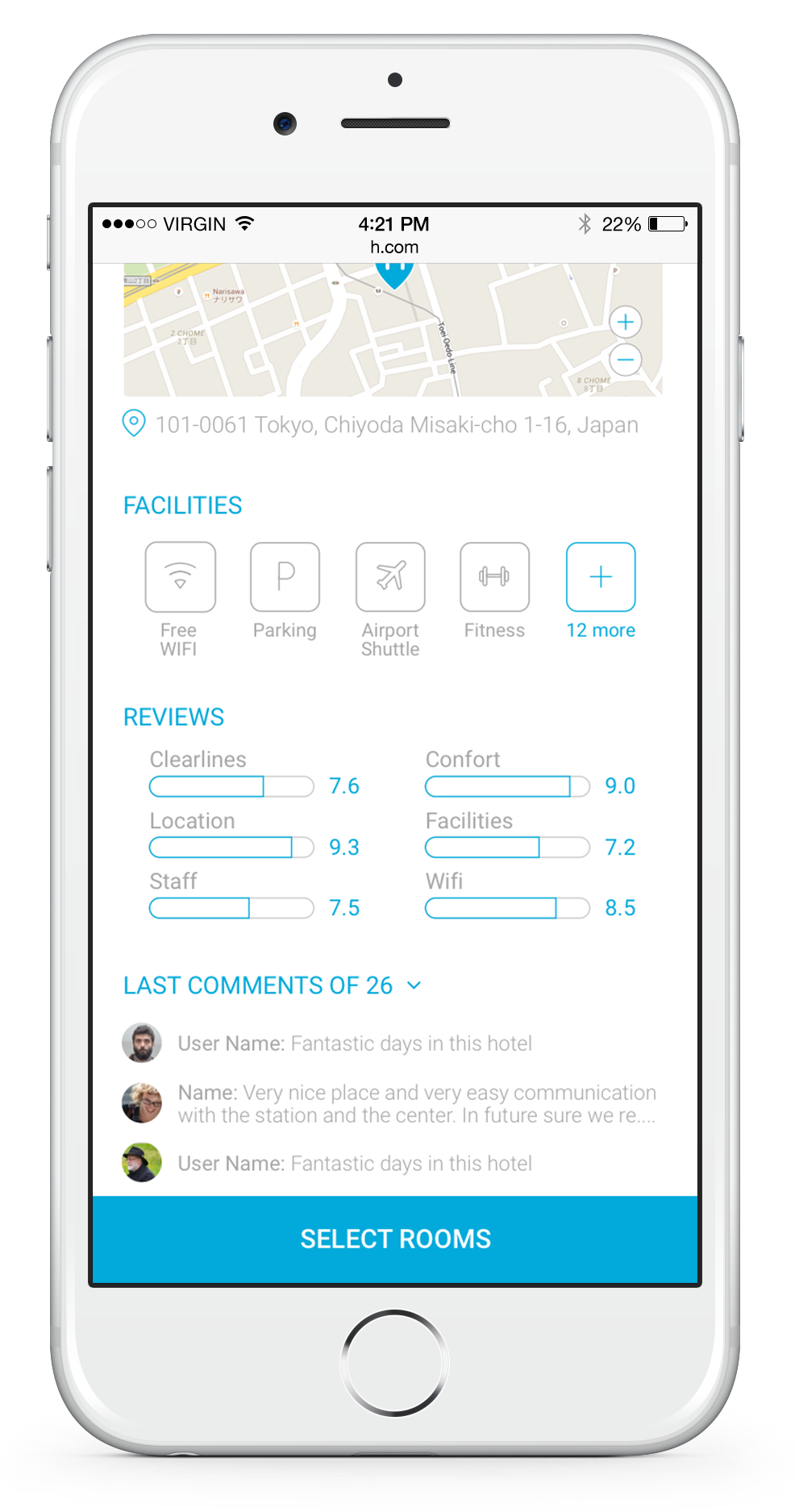
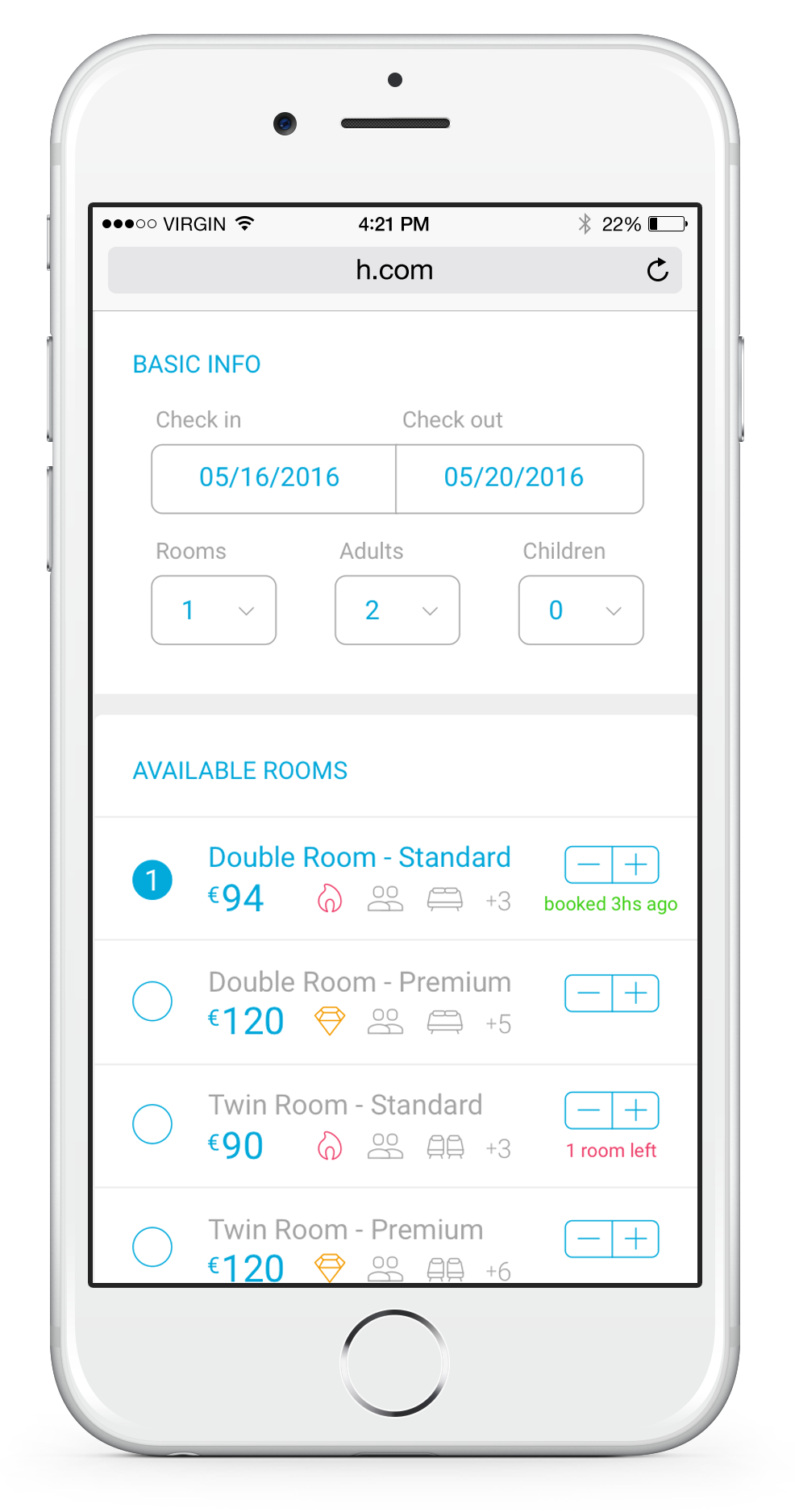
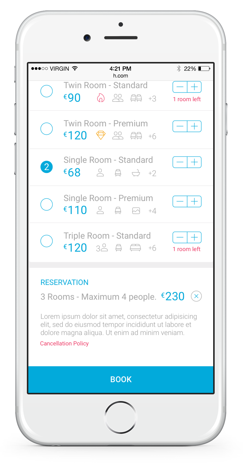
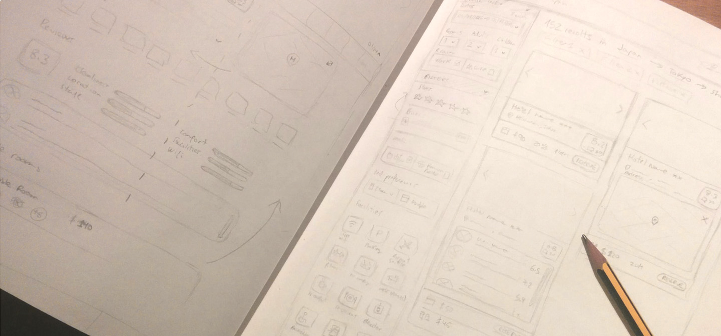
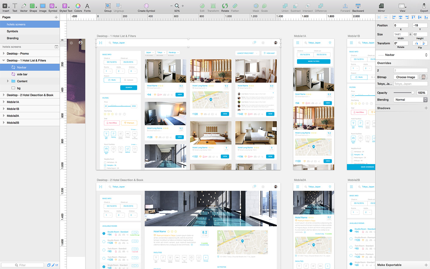
H
Responsive Site
Desktop App

Simple distribution for the elements of the site, whitespace fresh design only highlighting the buttons and the hotel's photos. In hotel detail page, users don't need the filters bar more and the new important thing users need are the available hotel's rooms and these replace the filters. Thats it is. Users don't need more for rent a room :)

Mobile App

Users will have the same experience as in desktop platform. Same items with the difference that make optional the view of the filters or the available rooms. At first the users only have to place the basic info and see hotels.

Work progress

I sketched and made the wireframes in paper. I saw this project clearly at first and I would not waste much time making wireframes with any tool. Later I designed the platform screens and all the components and icons in Sketch App, using Symbols and Styled Texts. Later I test the mobile site in Invision App.

Guidelines

I love Roboto Font Family (also SF Family) and when I want to simplify a design I prefer to use strong font family. Icons are linear and soft for not highlight more than the text in the platform. Icons in the platform are visual help but no essentials. And with the colors I know I should use a dark grey or black for texts. But I wanted to to experiment with soft design and as I said highlight buttons and hotel's photos.. but yes, maybe more dark next time :)

Conclusion

Con este proyecto quería realizar una app e-commerce o sobre accommodation en formato web y que fuera responsive sin alterar demasiado el contenido en cualquier dispositivo. Faltaría una muestra de tablet, pero creia que era demasiado obvio el resultado como para desarroyarlo. Proyecto aparcado y adelante. Espero os haya gustado.