-
About the project
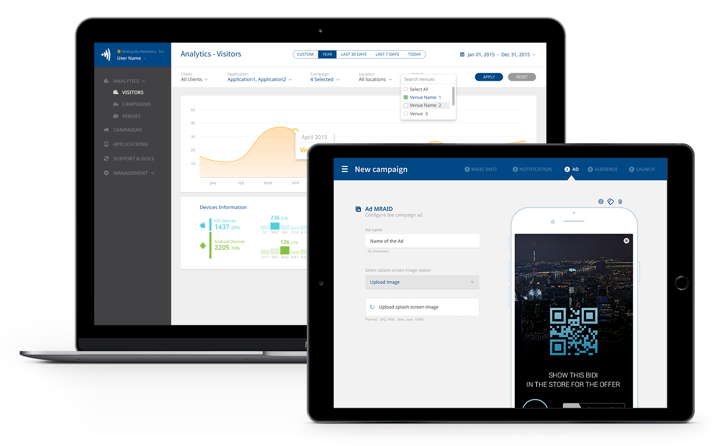
Mobiquity Networks powers a leading national location based mobile advertising and app engagement network in the US. They utilize a targeted, location-based approach to reach audiences on their personal mobile devices when it matters most. To do this, the development team in Barcelona had to develop a platform for Mobiquity Clients.
-
Objective
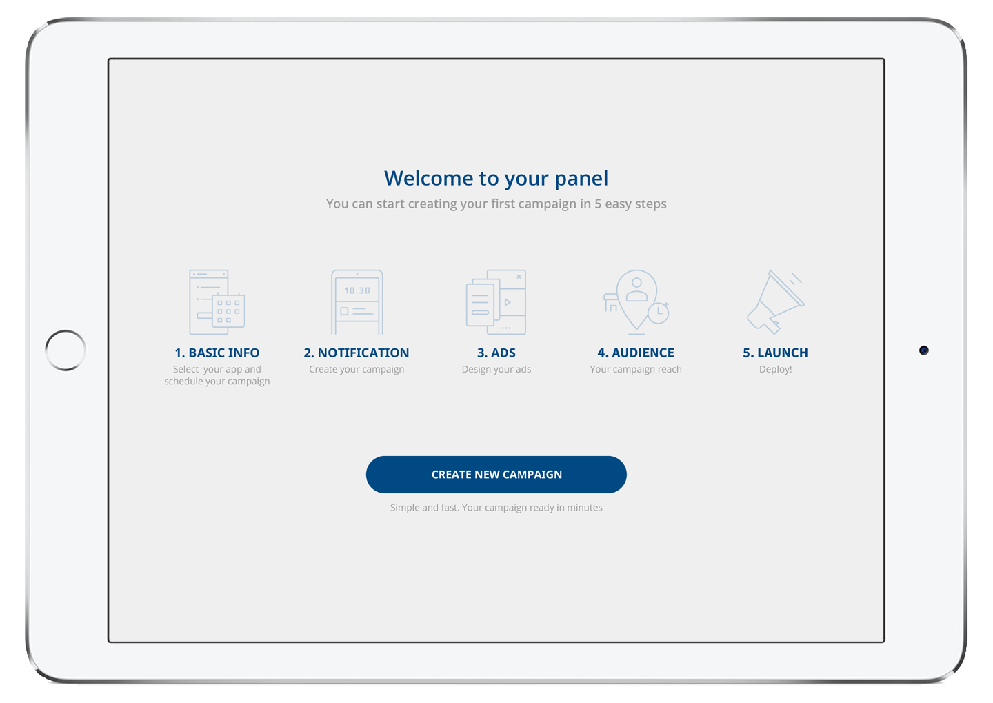
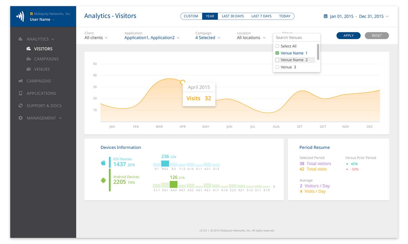
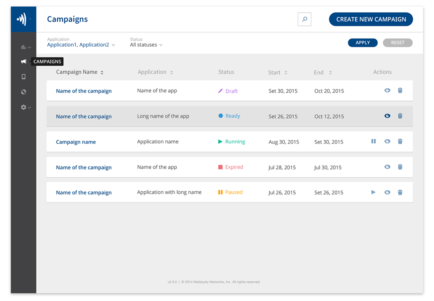
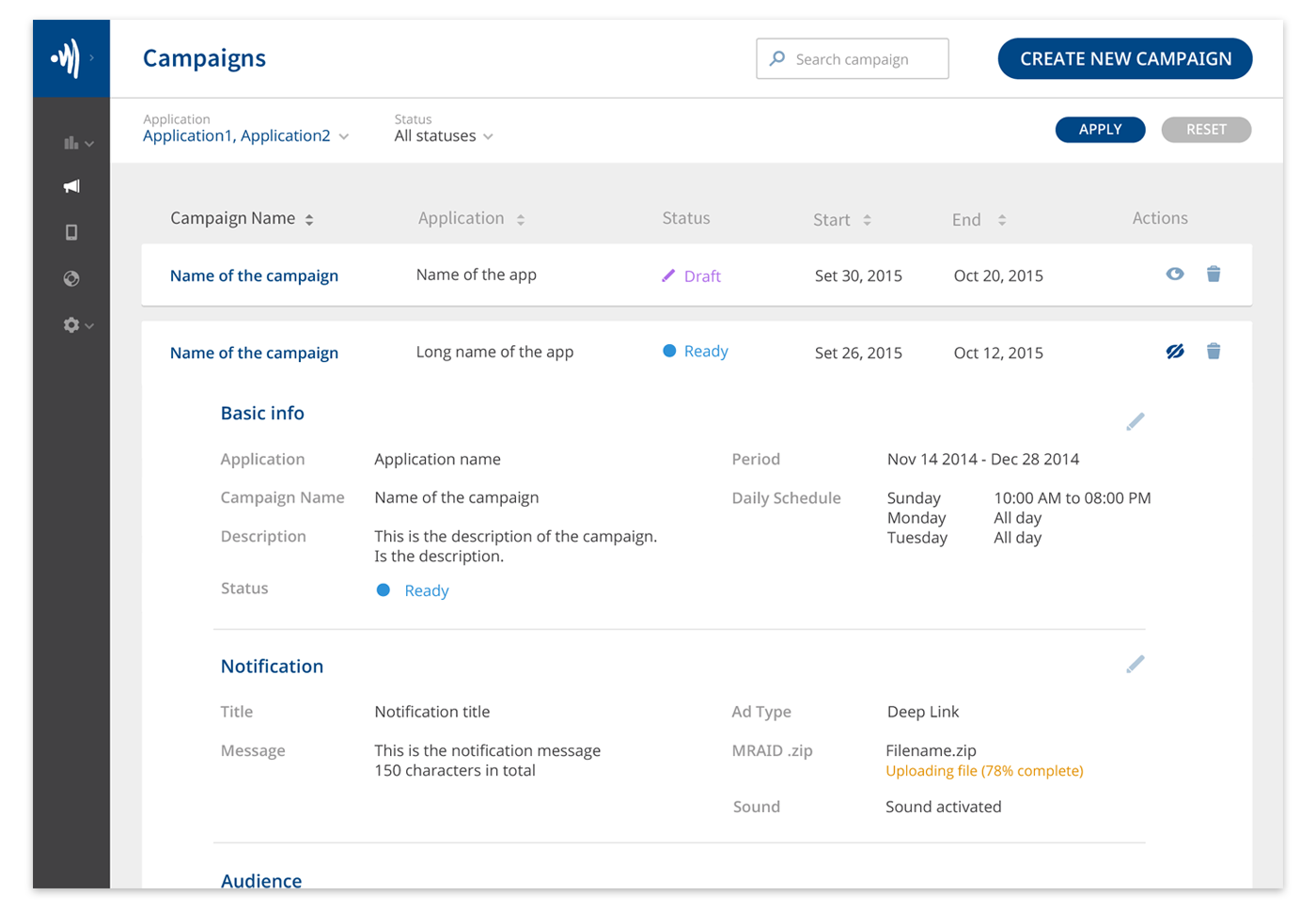
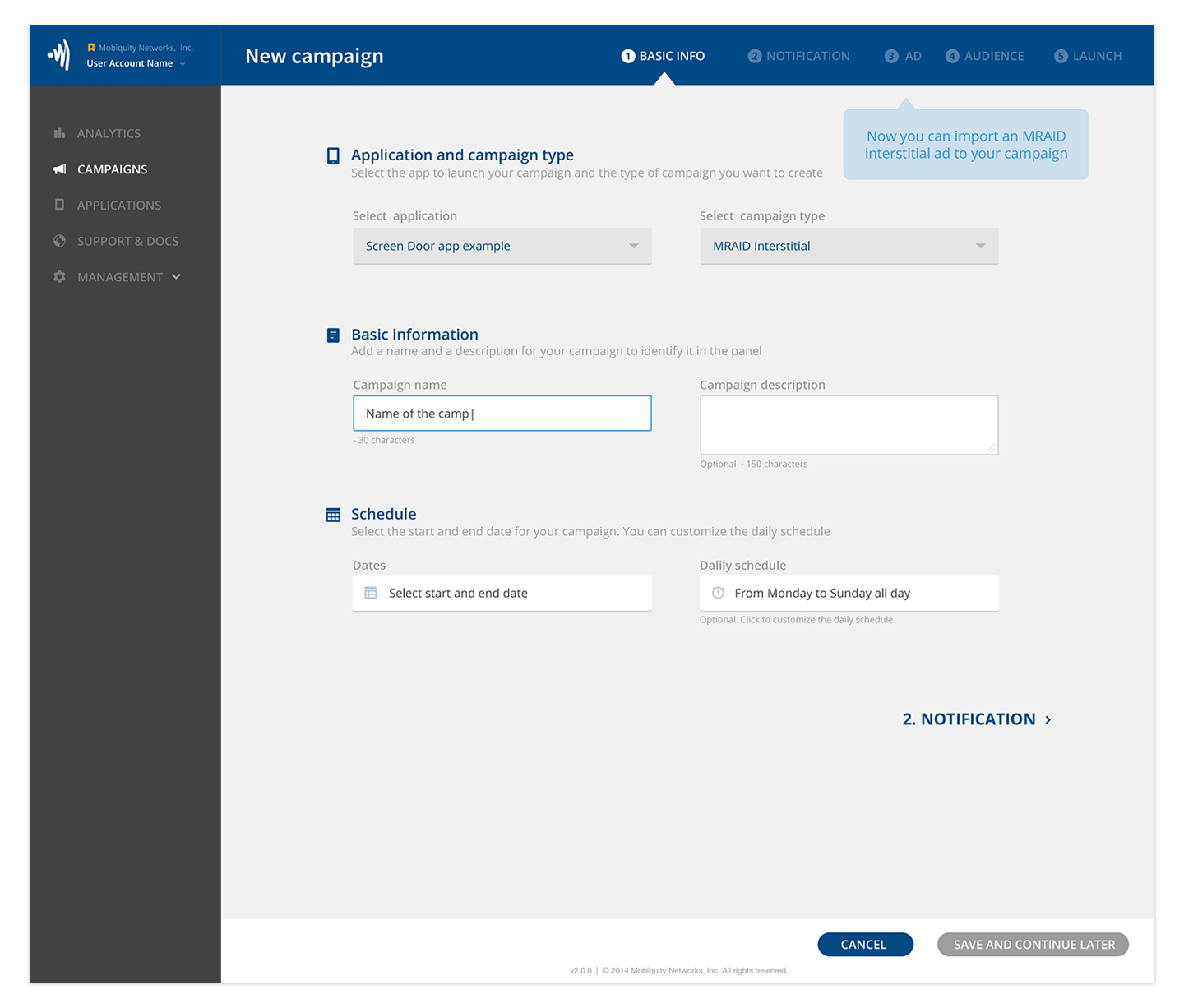
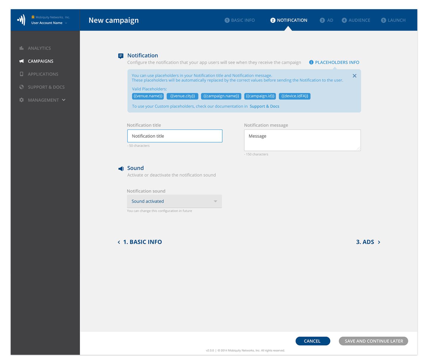
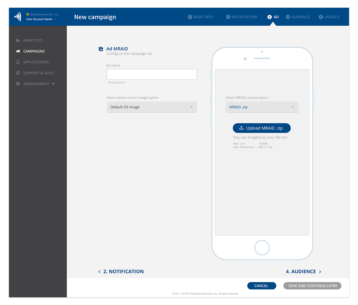
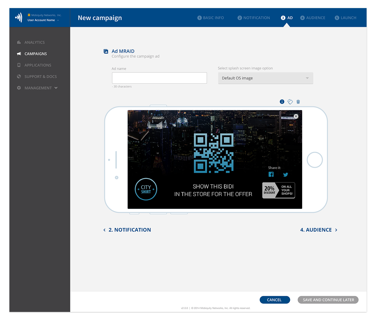
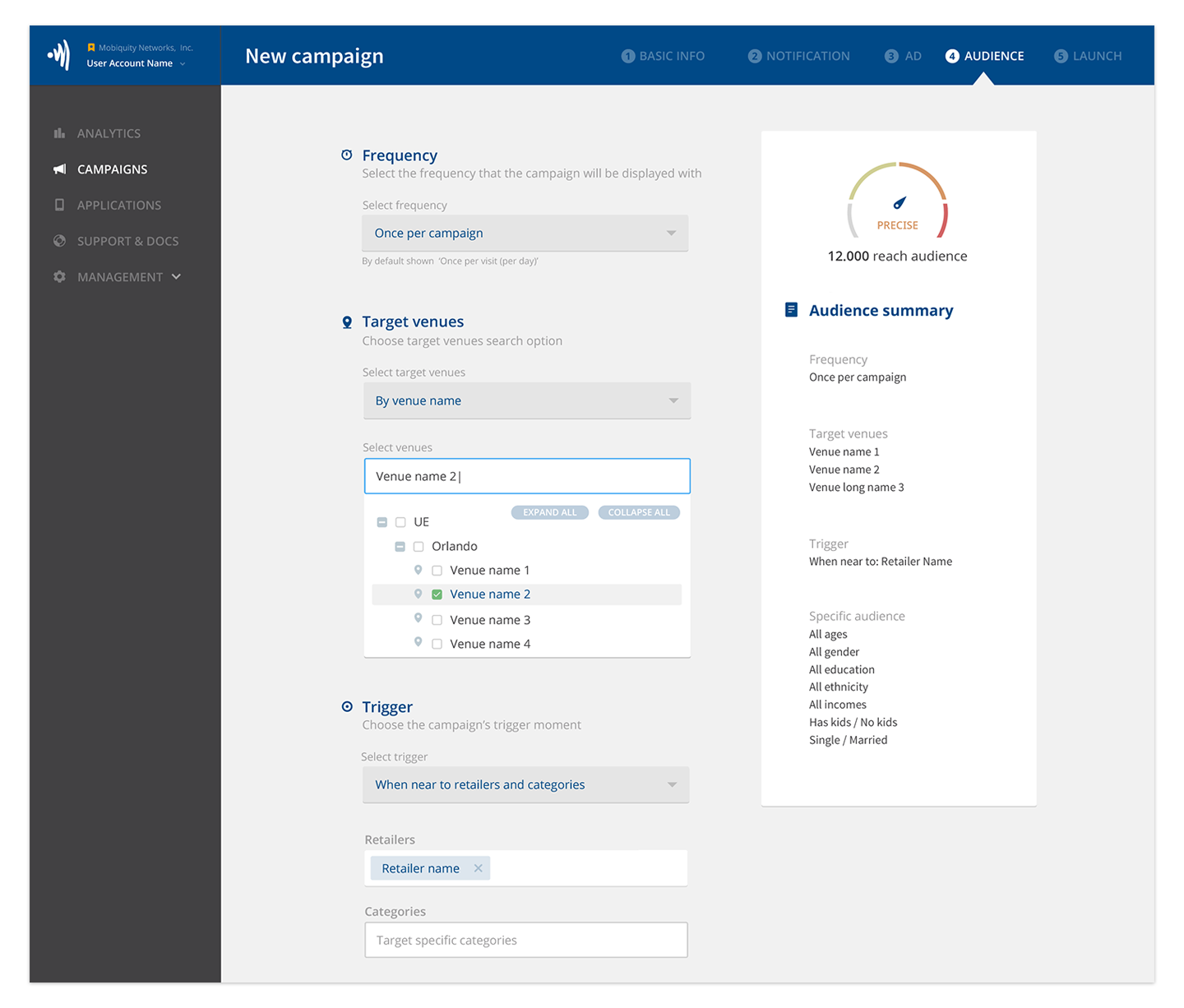
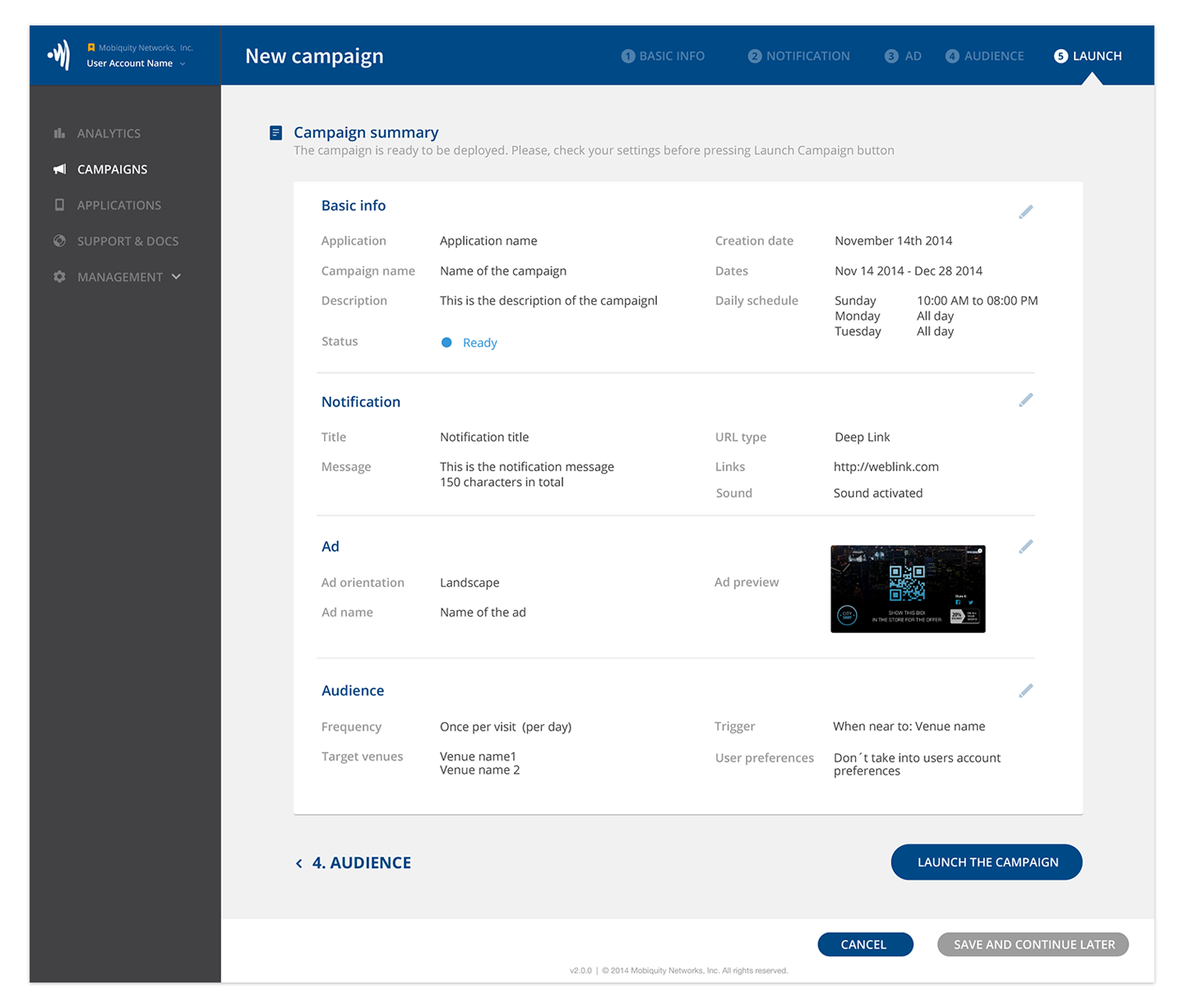
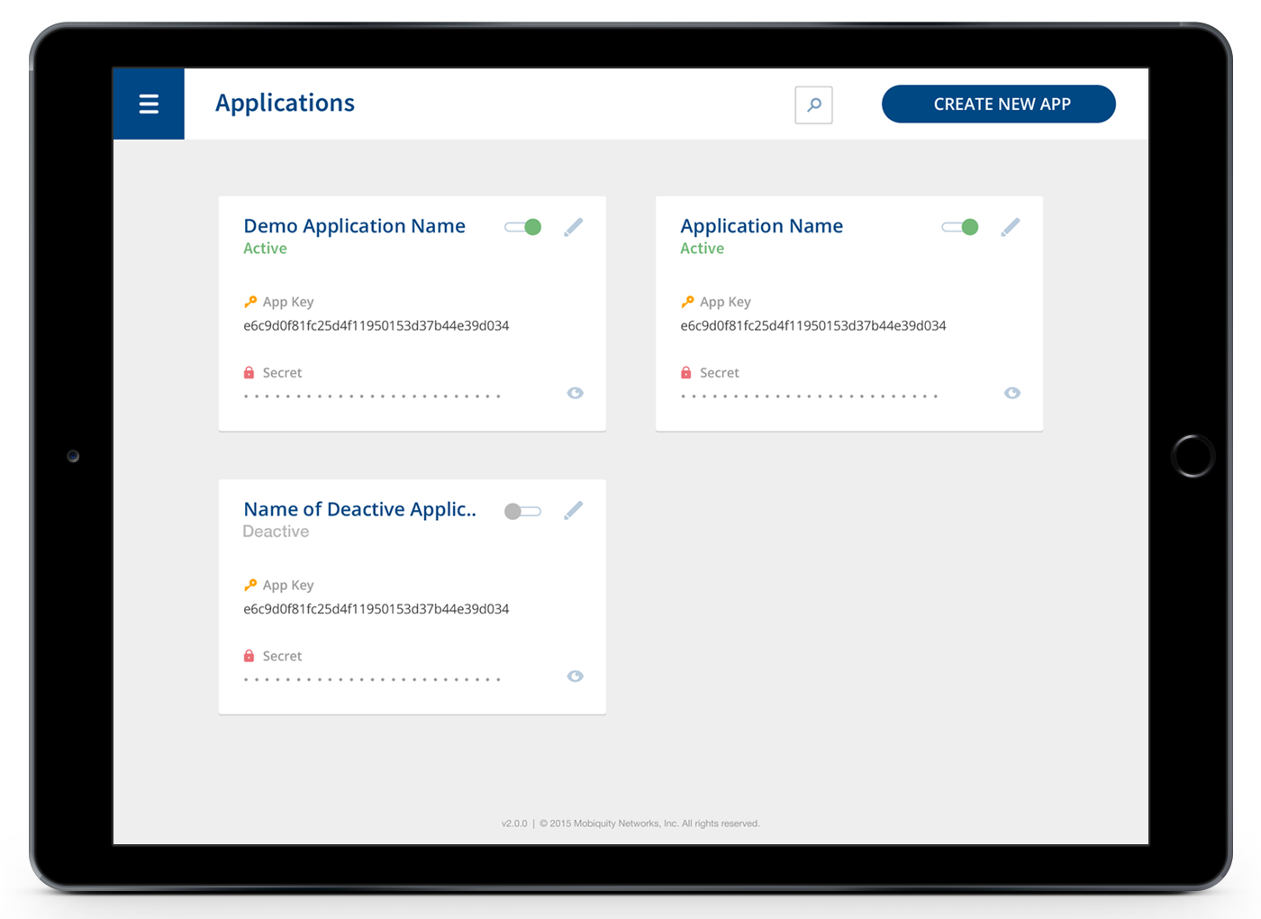
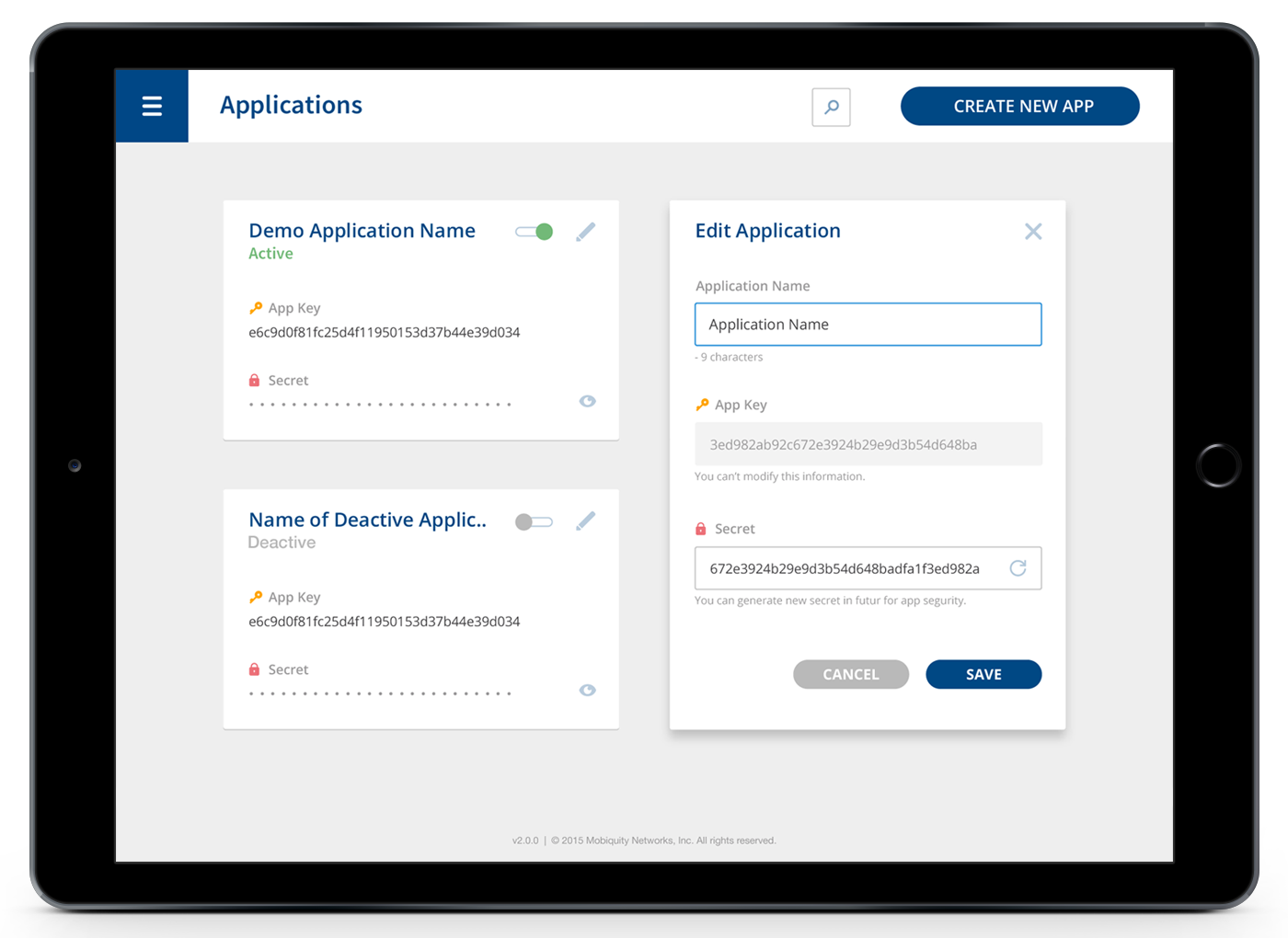
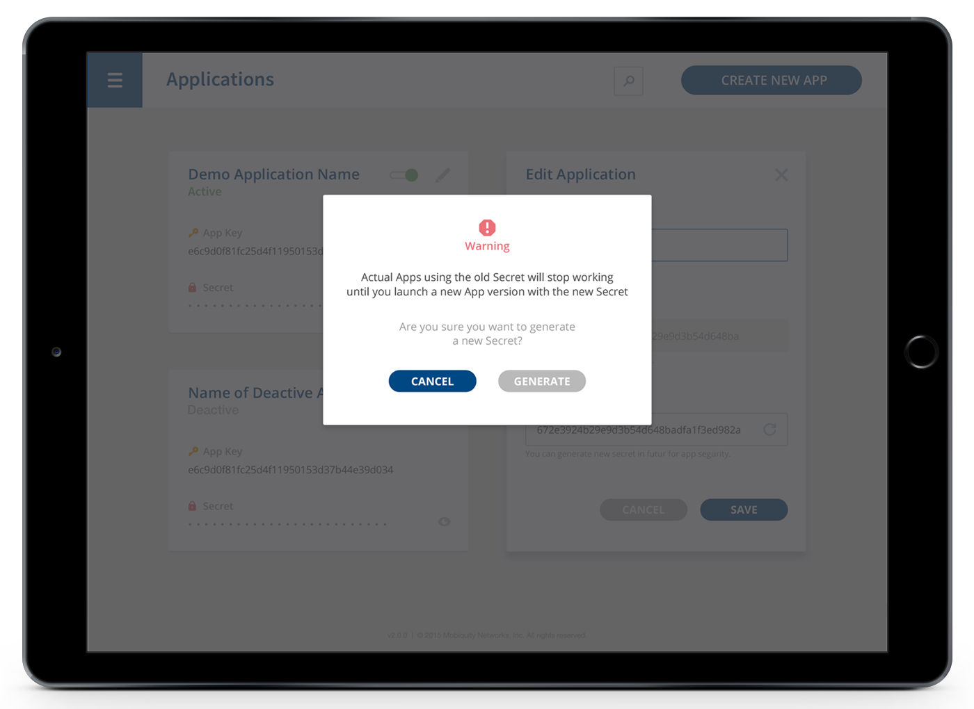
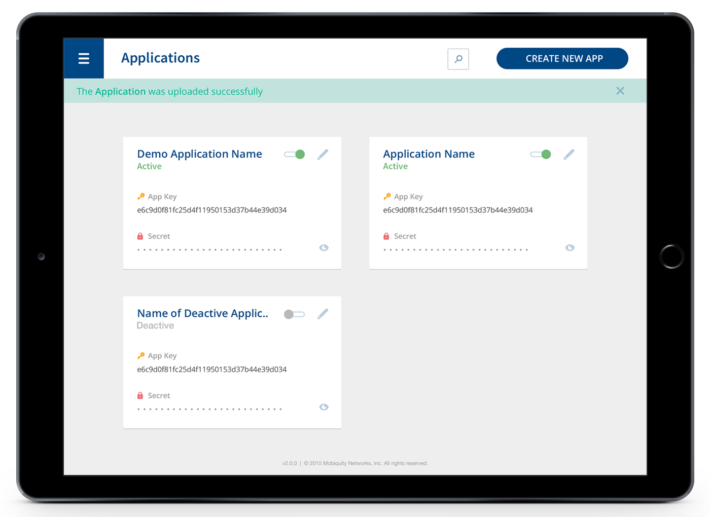
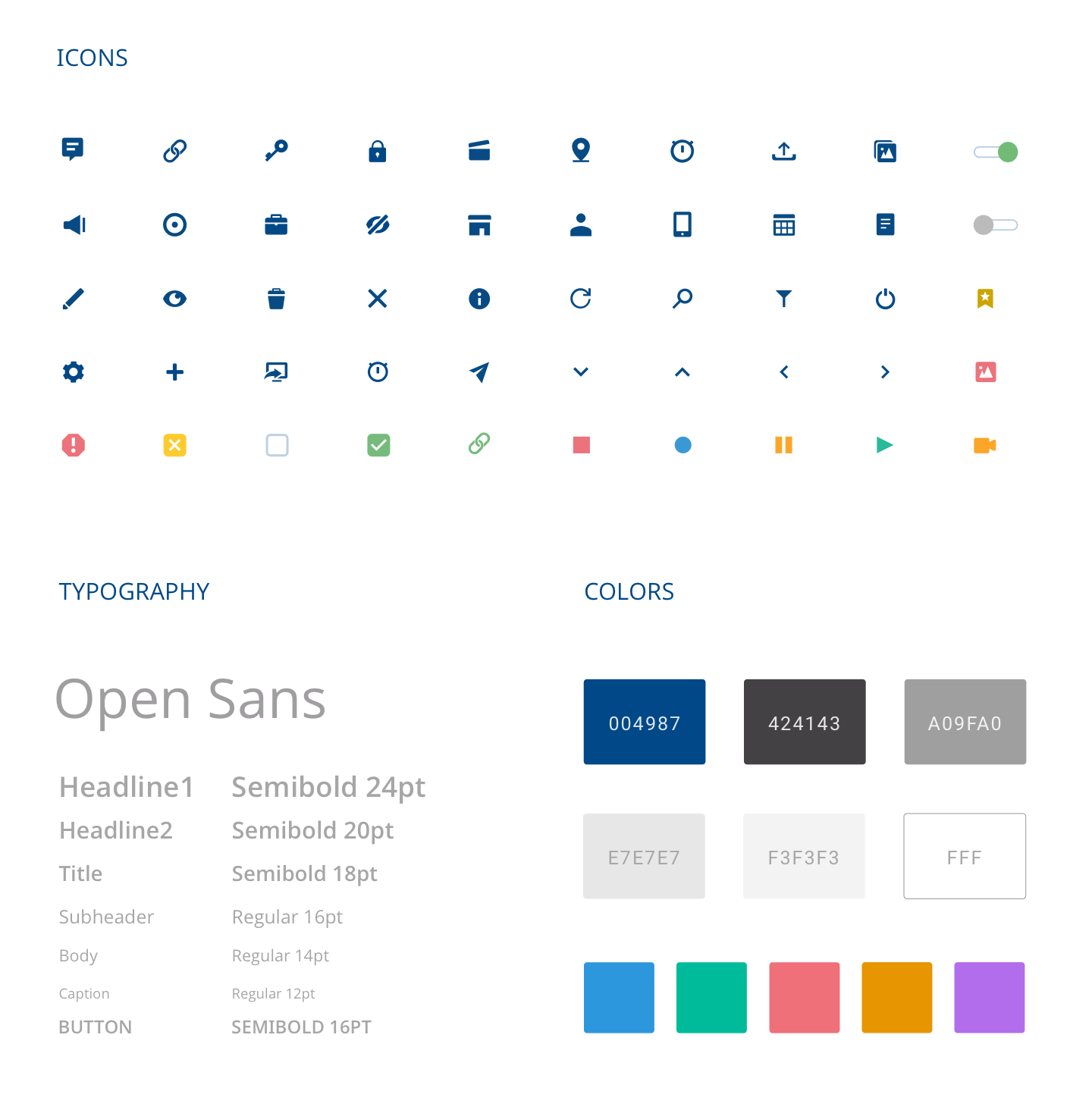
They had an unstable platform and needed to redo from 0. Therefore also decided to improve the user experience for its customers. My job was to simplify the design of the new platform and improve the user experience with a simple and clear interface.