-
About the project
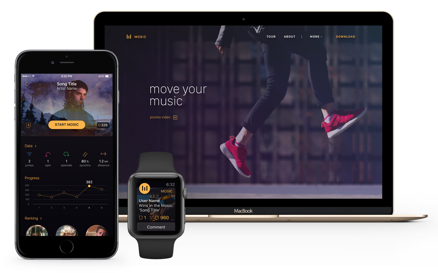
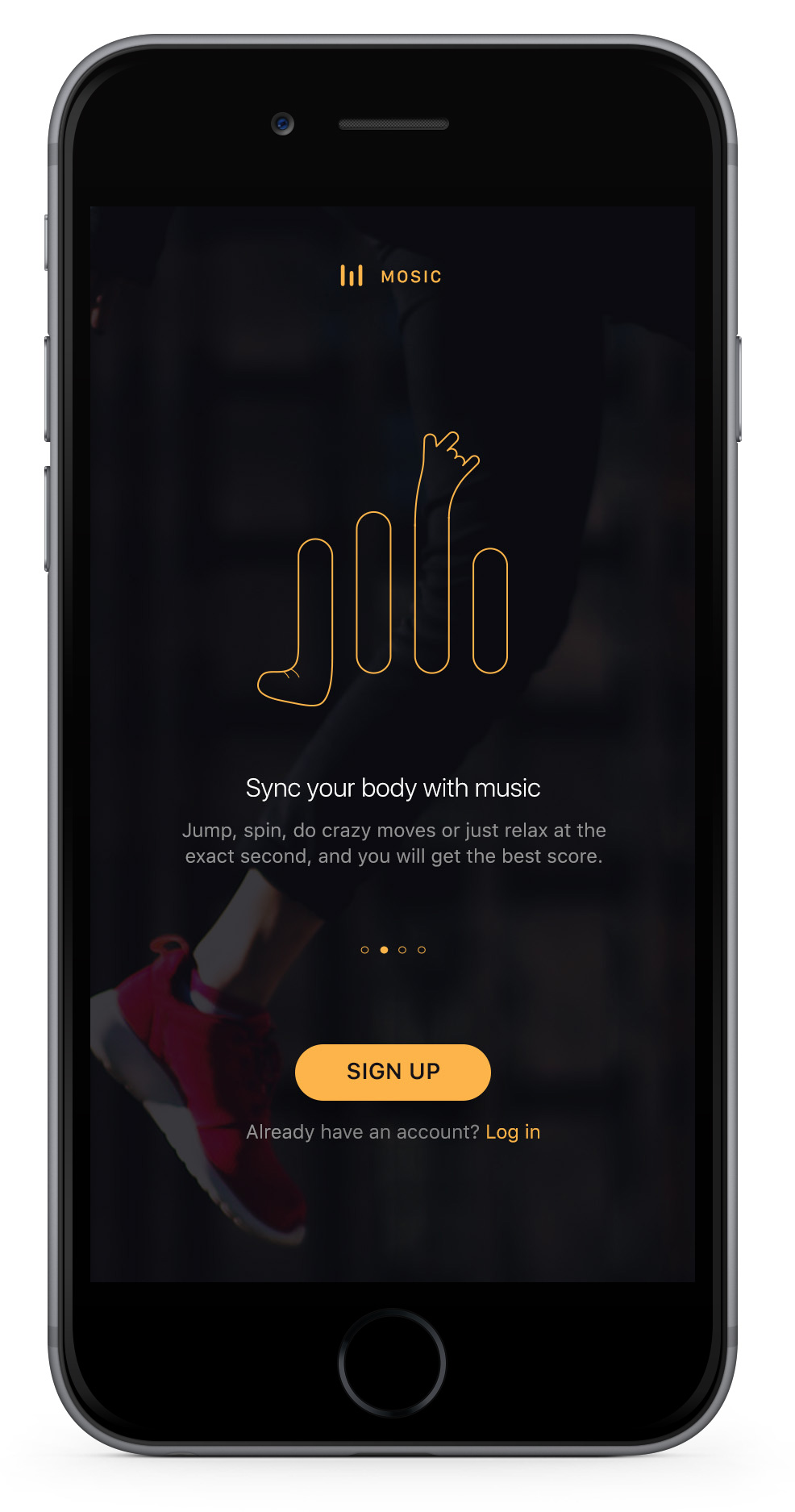
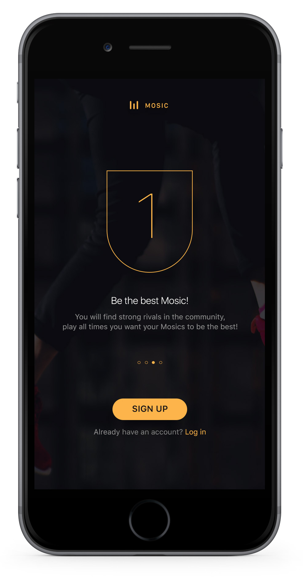
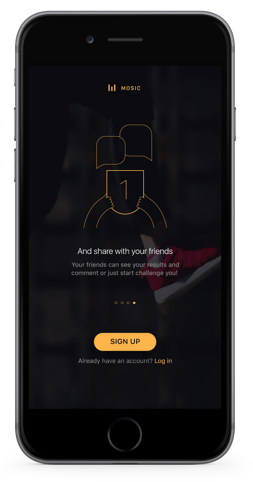
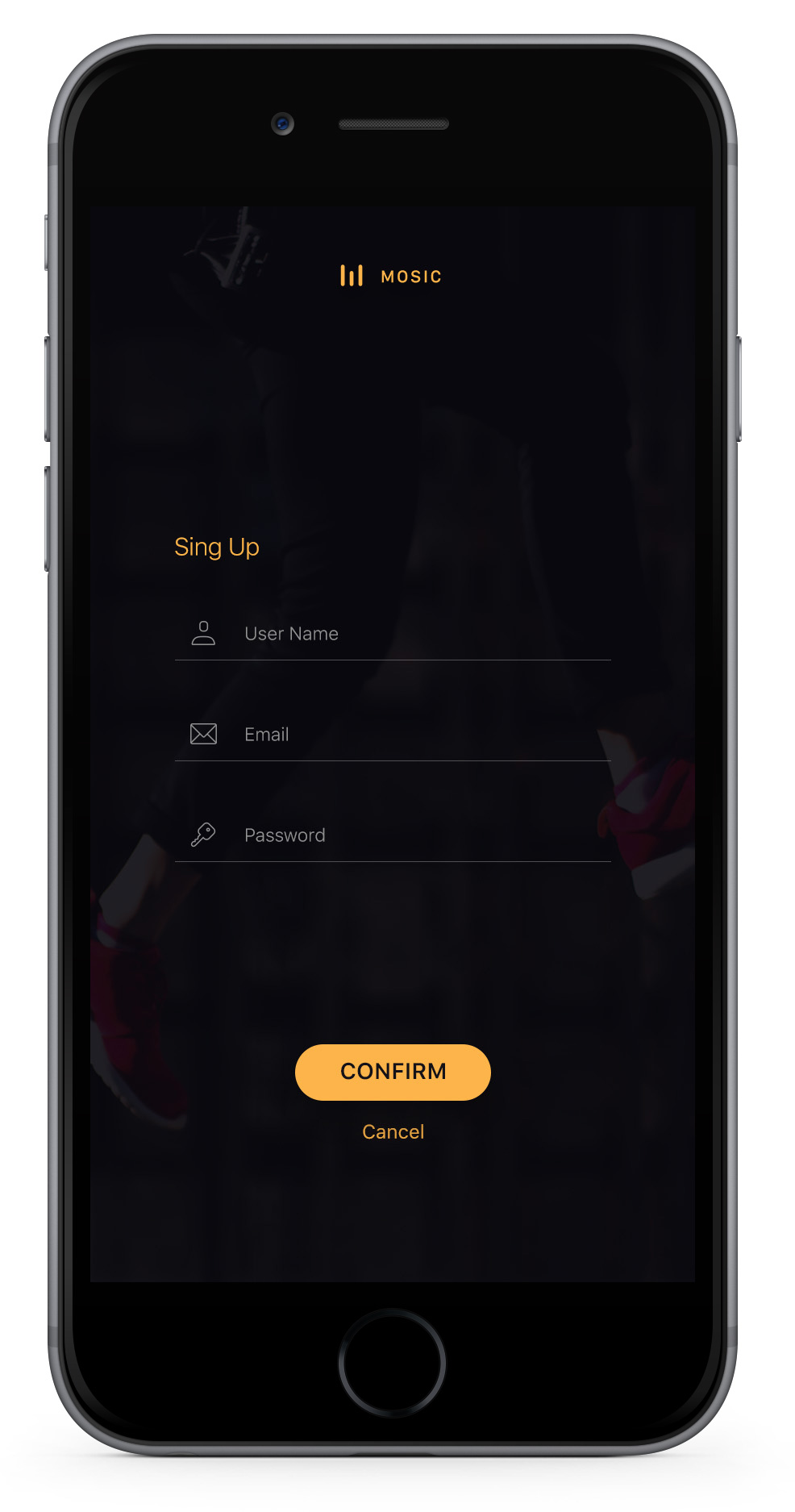
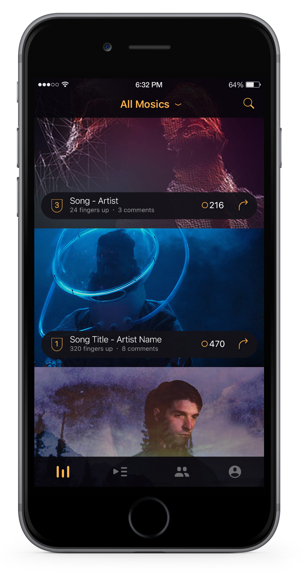
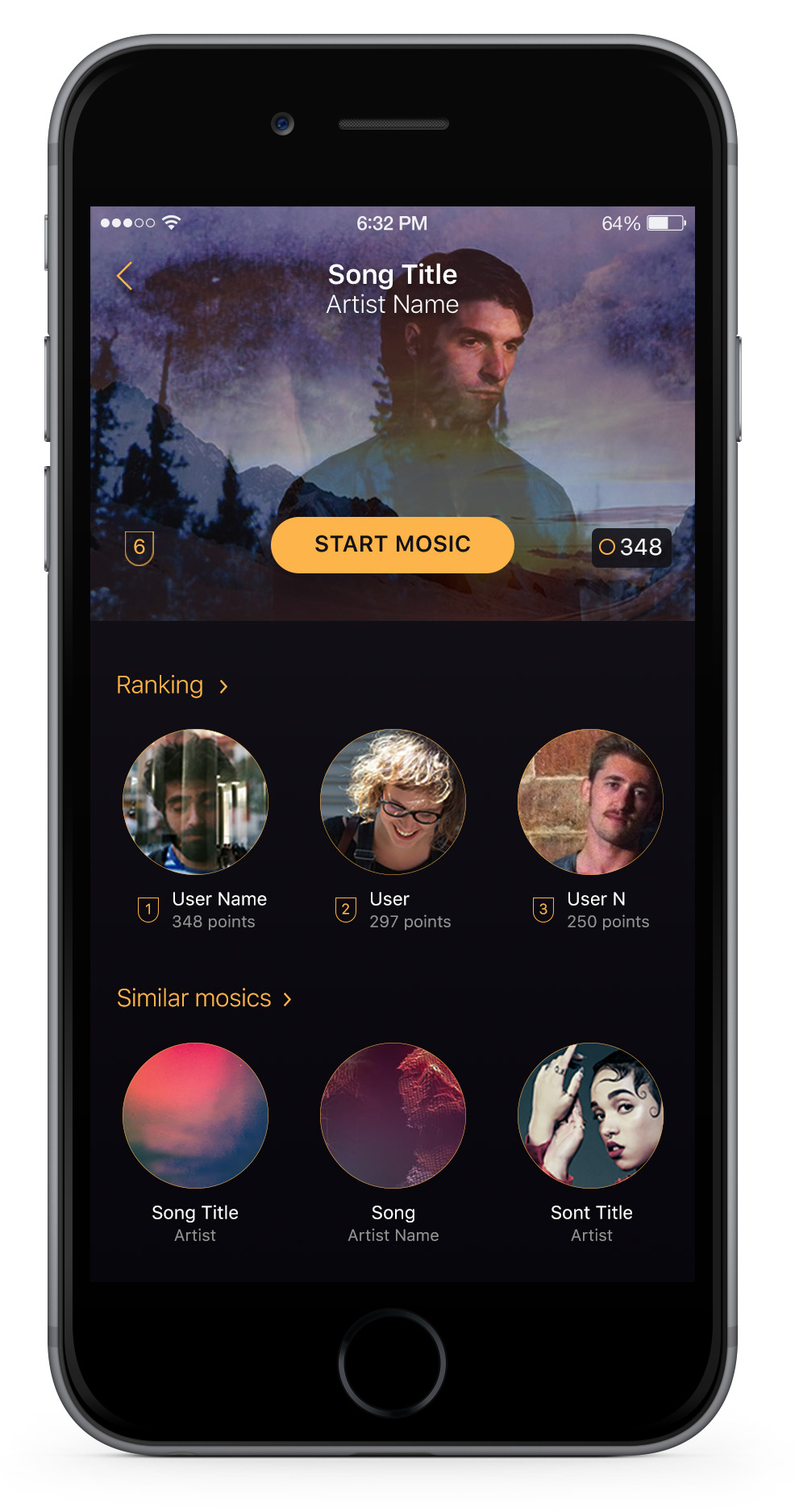
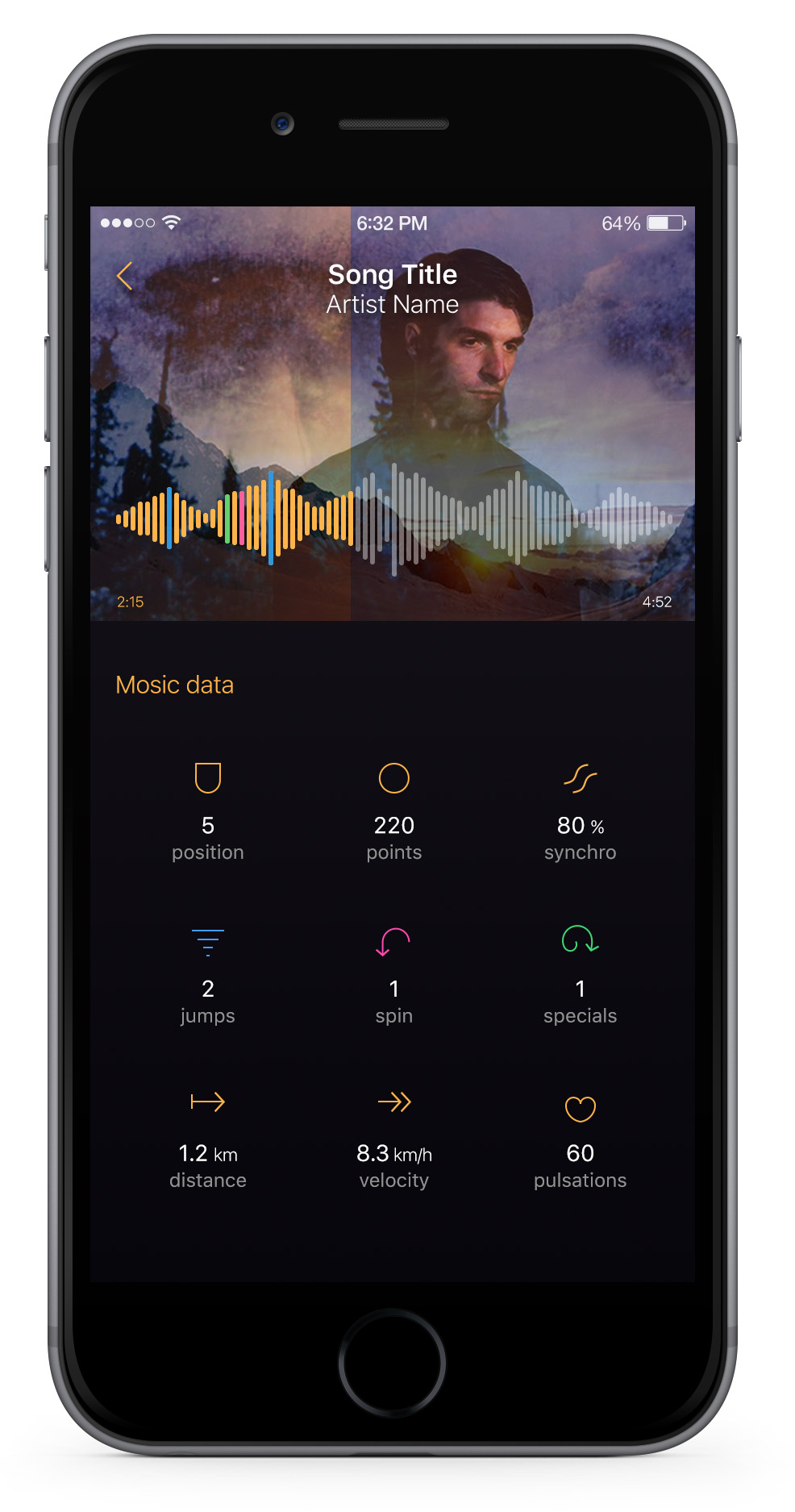
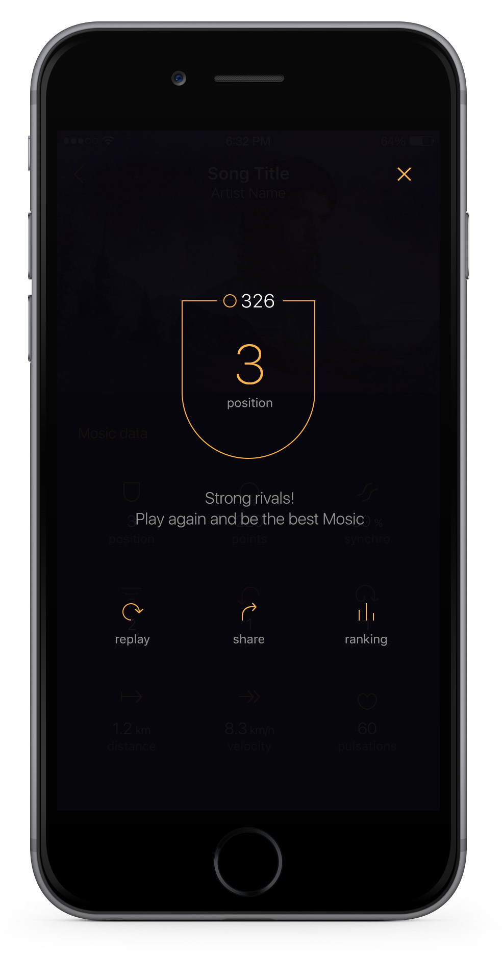
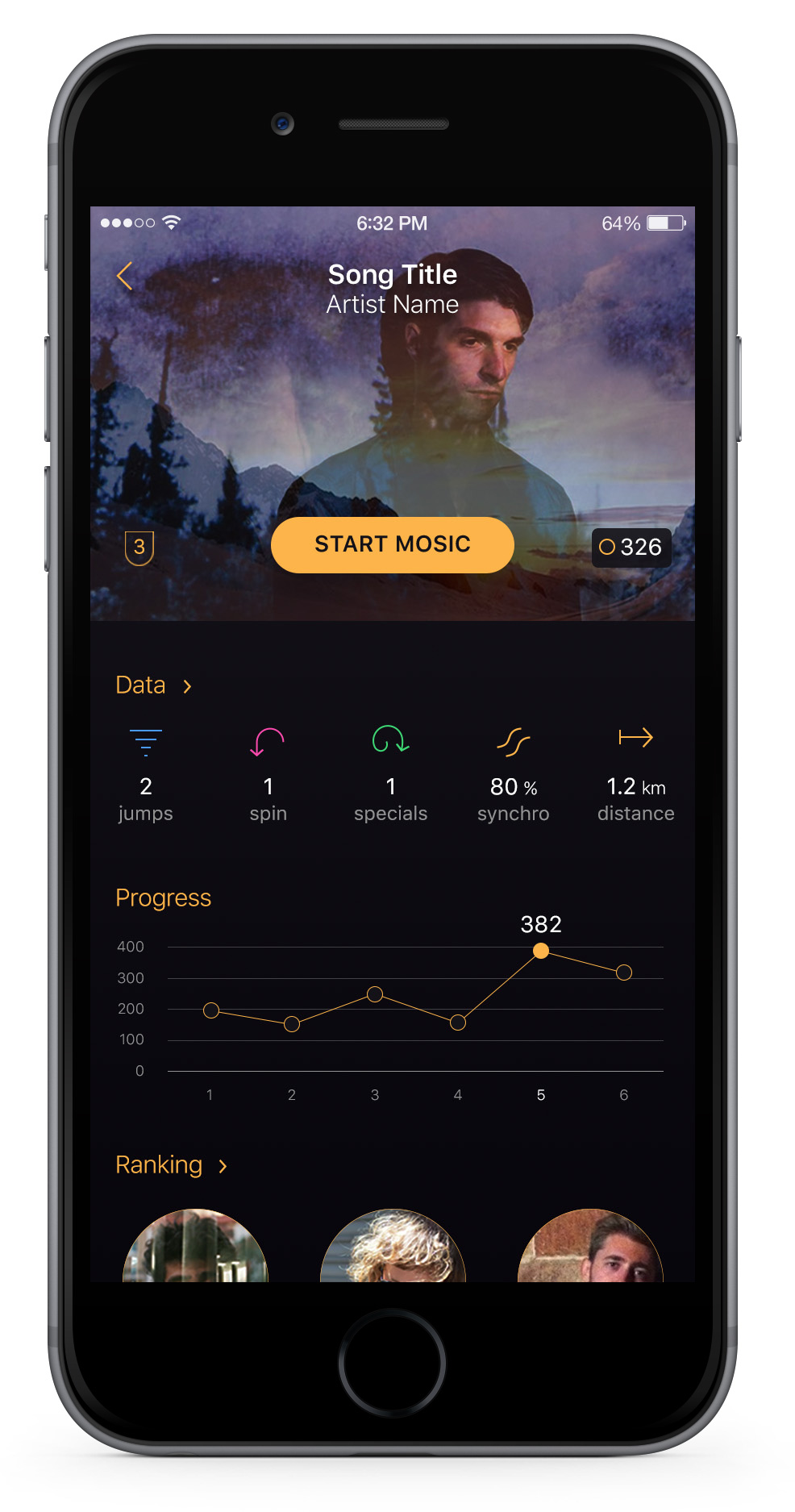
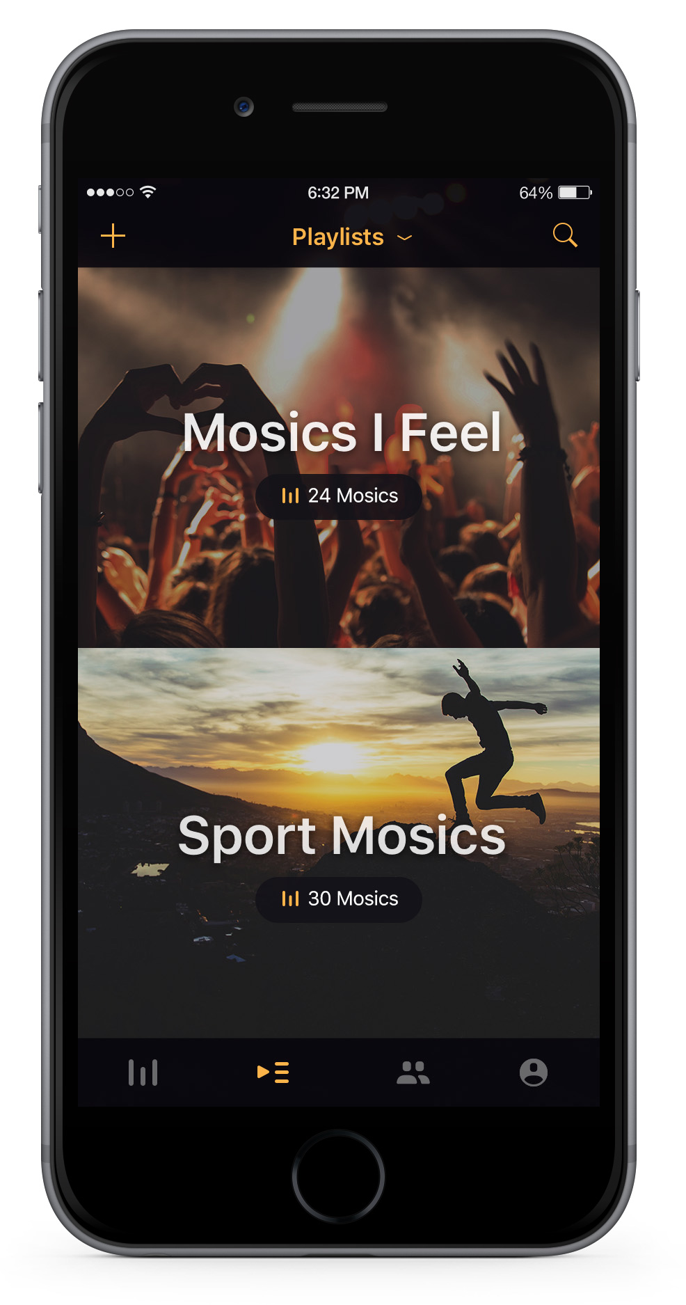
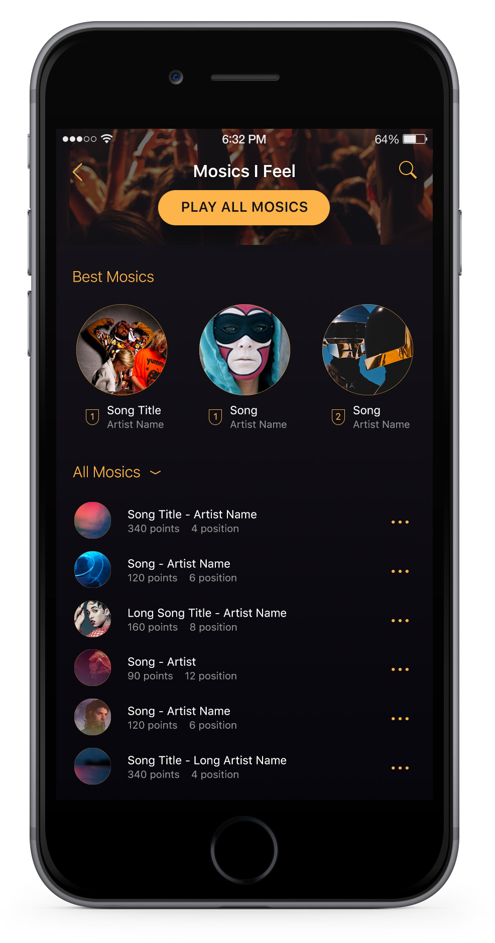
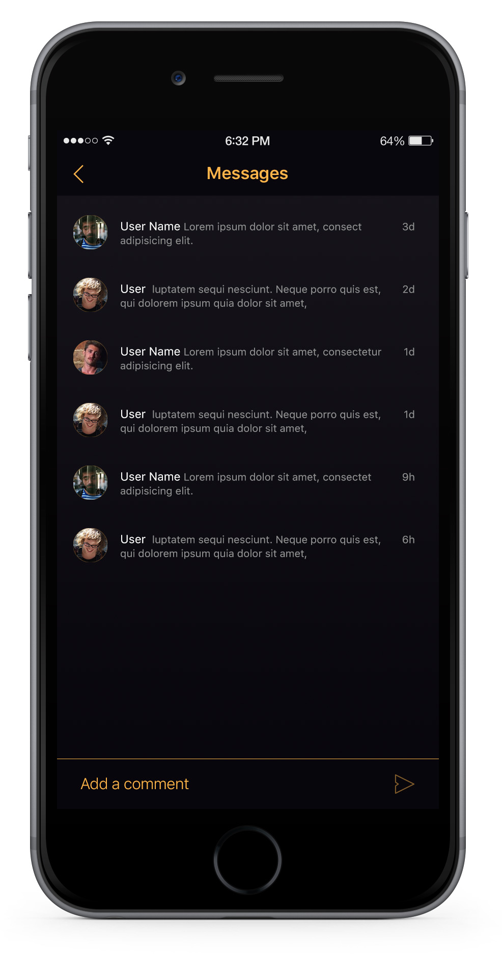
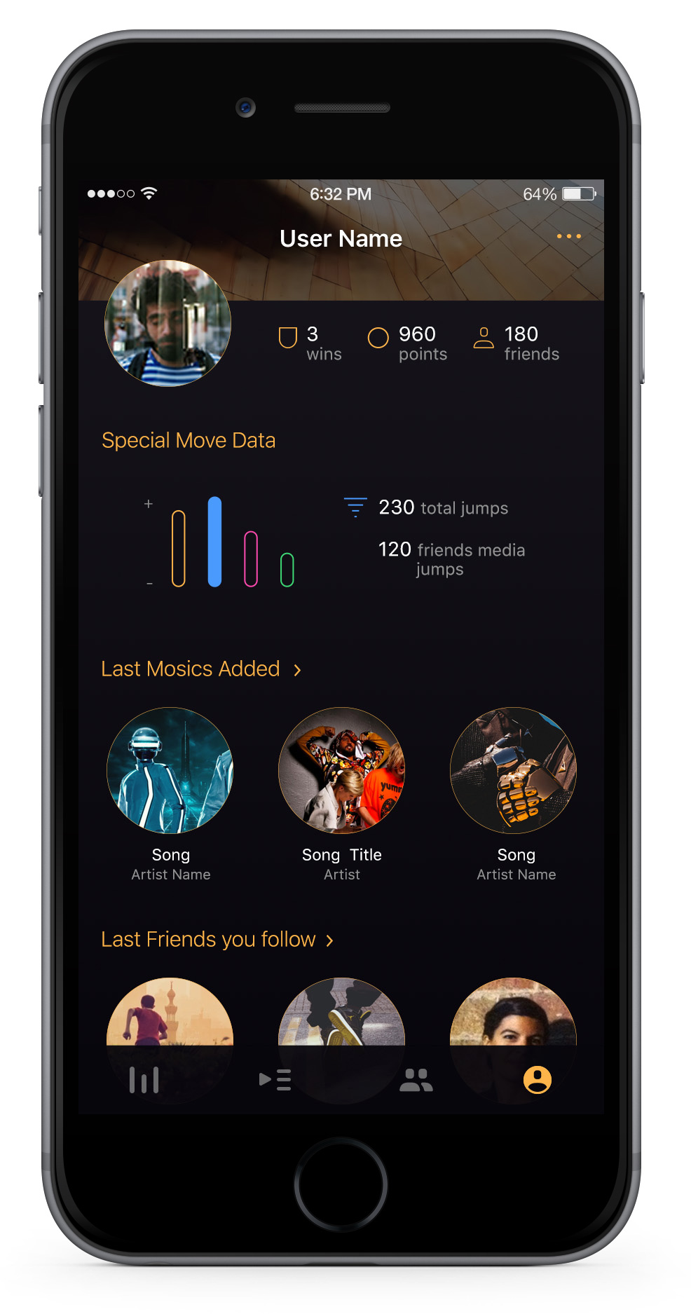
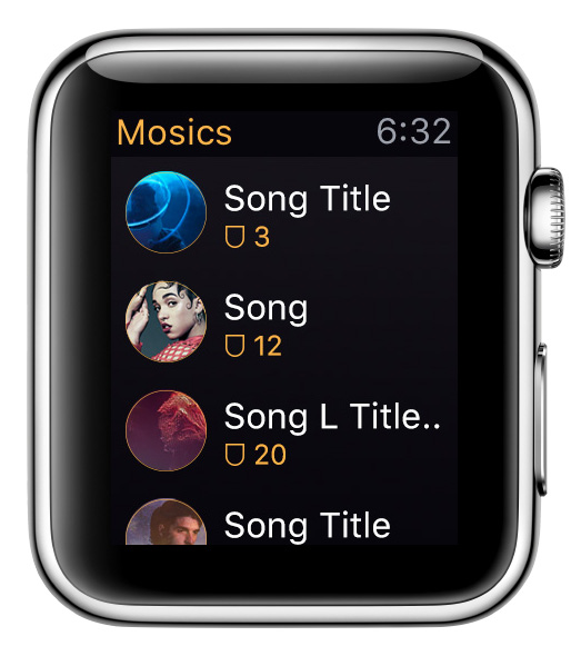
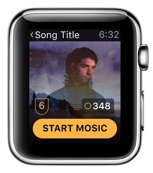
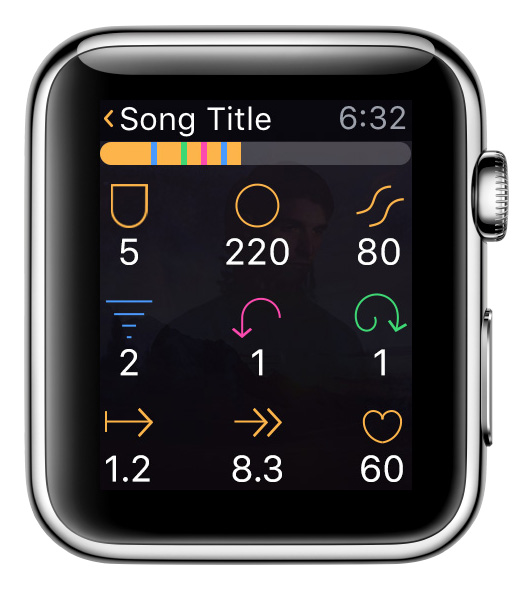
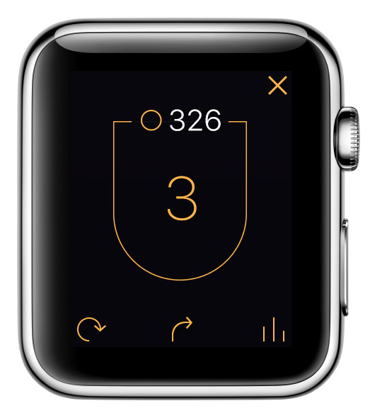
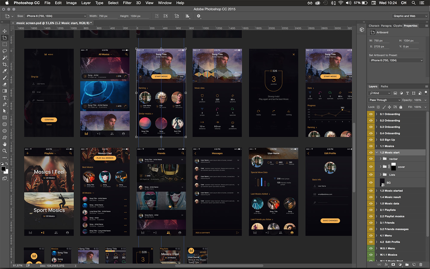
Mosic. MOve your muSIC. It's an app that make gamification with users music and they movements. Encourage the user to do sport in a different way. Listen their music and make movements in the correct time to win more points and be the best Mosics with their songs.
-
Objective
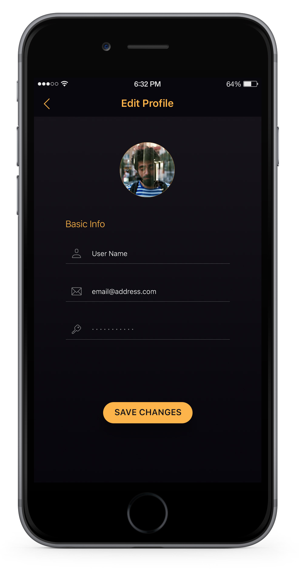
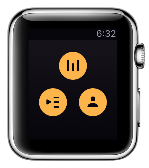
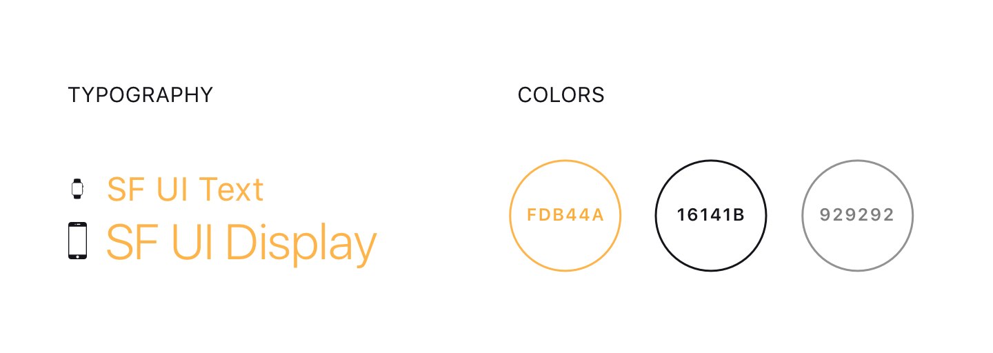
I wanted to experiment with a dark design and thinking in watch native application design from the beginning. Simple dark UI with light details for make an attractive design.